2010년 3월 31일 수요일

World's most technical pasta fork

이런 포크 하나만 있음 멋드러지게 파스타도 먹을수 있을텐데 ㅋ

Calamete-spaghetti-fork-1

Projecting "thumb" makes all the difference.

Worked for Homo sapiens....

Stainless steel.

AsDFGHJ

2-Pack: $44.

[via Hurricane Vanessa]

Alley Traffic Lights

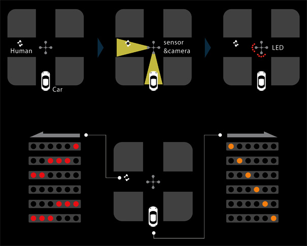
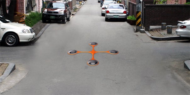
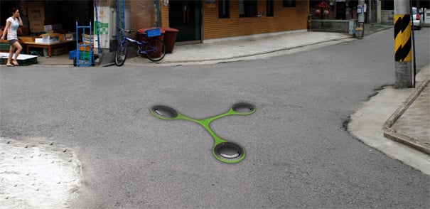
We don’t often think of congested alleys but in Korea they’re some of the busiest intersections where over 40% of accidents occur. Like a traffic light, the AISA is a 3 or 4 way signal. It’s made of titanium alloy with a round shape  to disperse direct forces. Small camera based sensors detect whenever foot, bike, or motor traffic approach and warns cross traffic with flashing LEDS. The color indicates the degree of danger and the flashing rhythm denotes speed. It’s not meant to control the flow of traffic like a stop light but it does give you a sense of what’s coming ahead.

Designer: Jeongseon Park
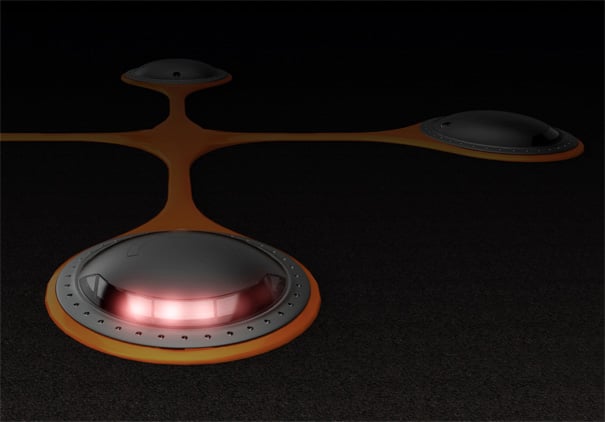
AISA: The device that informs for safety in alleyway by Jeongseon Park

aisa2

aisa4

aisa3

Taurus Concept

2020년 정도 되면 이런거 하나쯤은 가지고 다니지 않을까?


The all-electric Taurus Concept designed by Erik Lanuza.The Taurus Concept is a compact, urban-targe..(more...)
A.R.T.

뭐라 설명하기엔 어렵지만.. Component들이 조화를 이루는것이 아트!

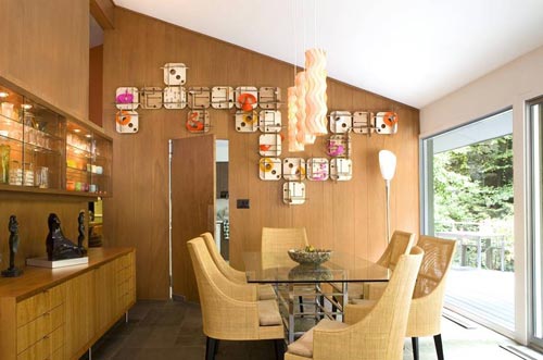
A.R.T. has launched the first fully-customizable and co-creative modular art collection called ModulA.R.T, with scalable contemporary geometric art modules that can be pieced together in an infinite number of ways. It is designed by artist and architect Donald Rattner and includes 3 lines: Wall A.R.T., Mural A.R.T., and Shelf A.R.T. They just launched their website and you can check out their pop-up shop if you’re in the DUMBO NYC area over the next month.

Wall A.R.T. consist of a series of atomic modular sculptures that can be assembled in many different configurations to create a beautiful wall design.

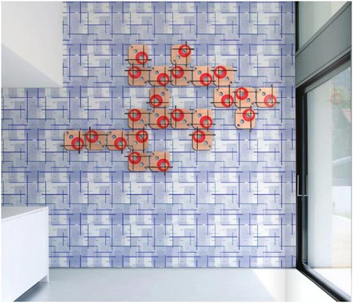
Mural A.R.T is artist-designed wallpapers featuring various shapes that add a new dimension to the wall when placed behind Wall A.R.T.
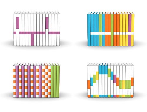
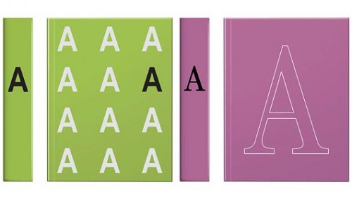
Shelf A.R.T is a series of modular artist-designed books to fit in-between your precious leather-bound volumes, or you can put Shelf A.R.T alone in a bookshelf, turning it into a modern piece of art. Choose from colorful designs or order serif and sans-serif letter books to spell out whatever you wish!
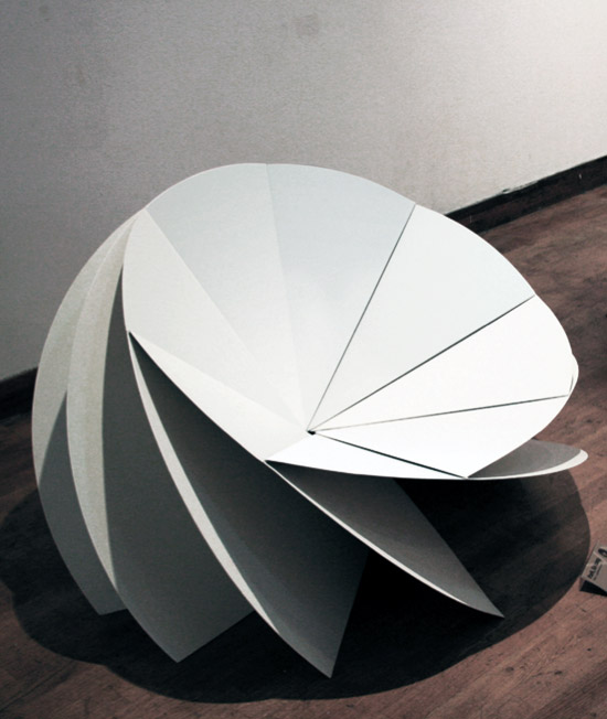
eerang park: bloom chair

와.. 이건 정말 설계한 사람이나 제작해주는 사람이나..
골치 꽤나 아팠겠는걸.. 한국 여자 학생작품이네.. ㅎㅎ


'bloom'

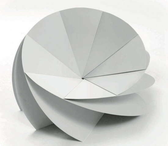
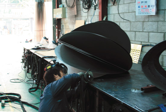
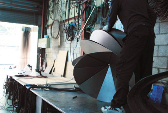
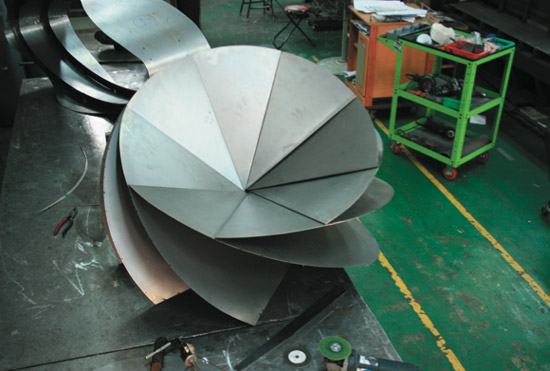
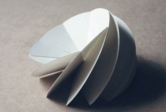
'bloom chair' by korean desinger eerang park, is constructed from eight folded steel plates.
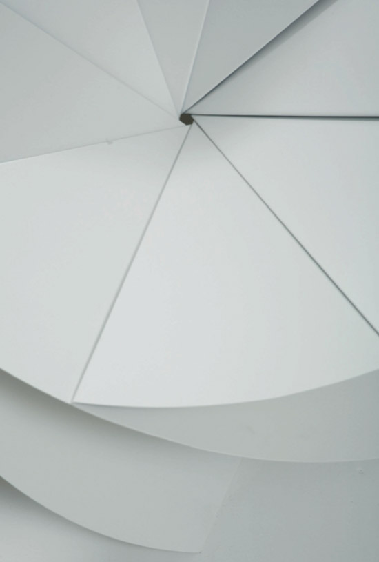
each of these pieces are attached at a central point and fanned in a circular arrangement
at an angle of 35 degrees from each other. in this formation the plates lean up against one another,
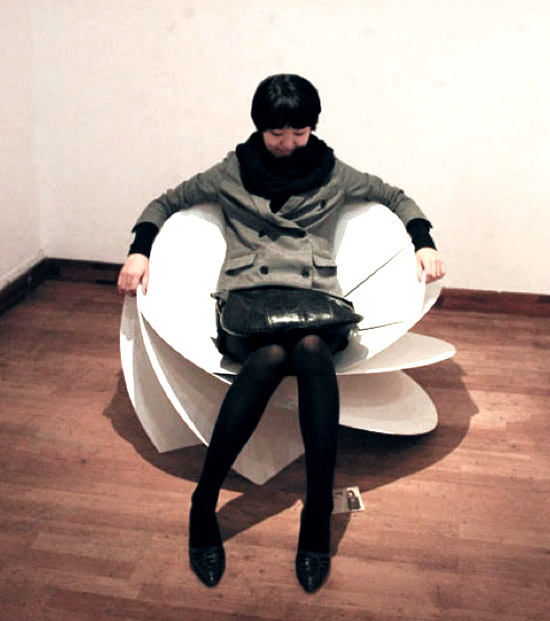
maintaining a strong structure, in which they simultaneously function as the legs, seat, back
and armrests of the chair.


eight folded steel plates are used to construct the seat


demonstrating the chair


detail of the central point where the plates are attached

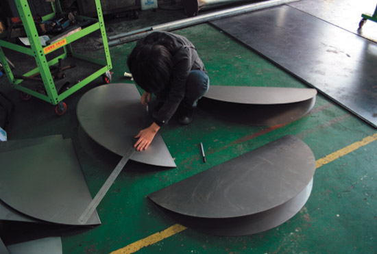
production process:


marking the steel plates for cutting


sanding down the edges of the plates


attaching the plates


the completed model


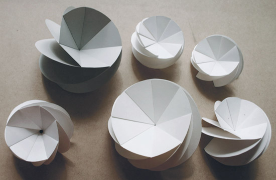
preliminary paper models of the 'bloom chair' form


silke hilsing: impress flexible display


Flexible센서를 이용하고 알듀이노 프로세싱을 활용한 작품
이런식으로 바리솔 같은 소재를 활용하면 저런식으로 응용도 가능하겠구나.


image: silke hilsing

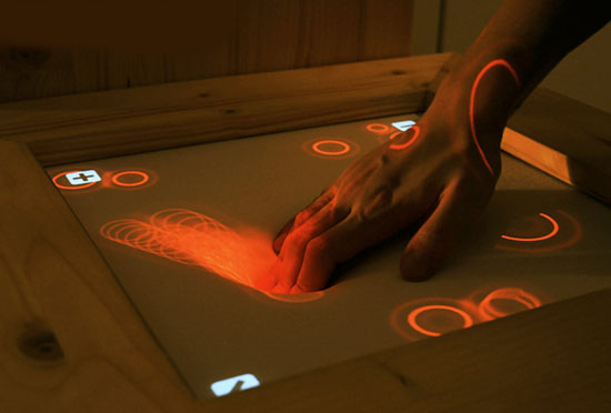
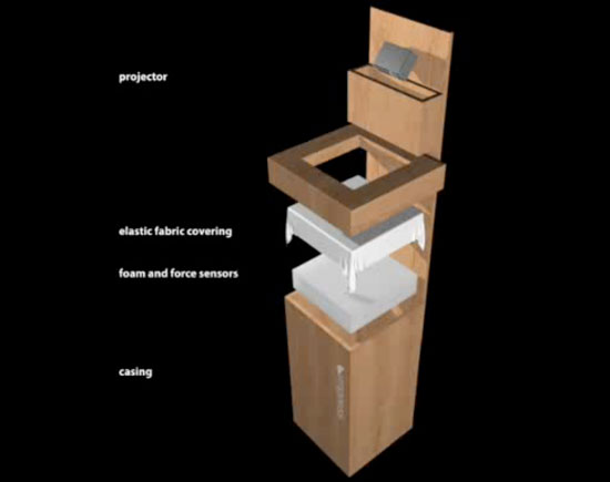
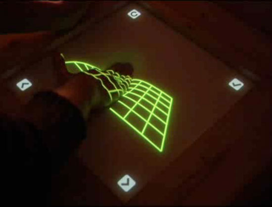
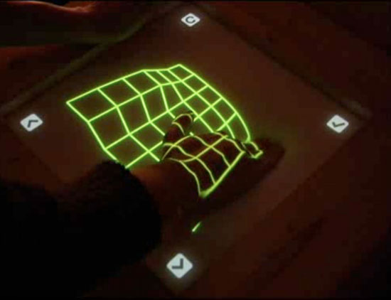
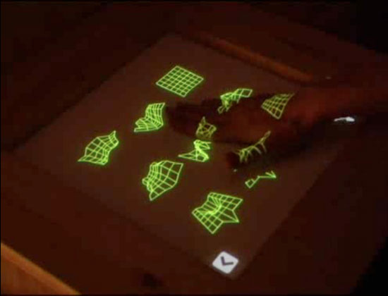
impress is a flexible display created by german designer silke hilsing that enables touch interactivity with
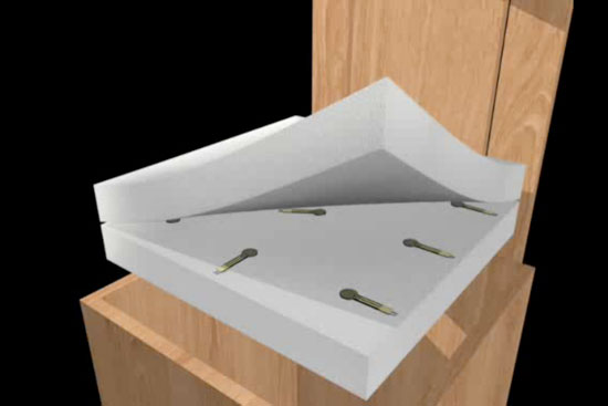
feedback. the display uses arduino and processing to run sensors sandwiched in between pieces of foam.
when the user touches down on the foam, they trigger the sensors which in turn communicate with an
overhead projector. the motivation behind the project was to remove the technical stiffness from touch
screens, bring the technology closer to the user by making it more human. unlike a regular touch screen,
impress also measures the intensity of the pressure. the user can pres slightly for a small reaction or press
down firmly to trigger more intense reactions. hilsing also laid out four scenarios for the screen including
3D modeling, 3D galleries, music creation and news reading.

http://www.silkehilsing.de/impress


image: silke hilsing


image: silke hilsing


image: silke hilsing


image: silke hilsing


image: silke hilsing


shin yamashita: land peel

일본에서 제품디자인을 전공한 한 학생의 작품..
제품화 되어 있다면 당장이라도 사고 싶은맘인데.. ㅎㅎ

거실이 넓어야 이런것도 깔아두겠지? ㅋ


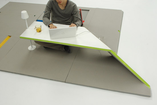
'land peel'

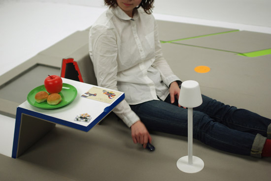
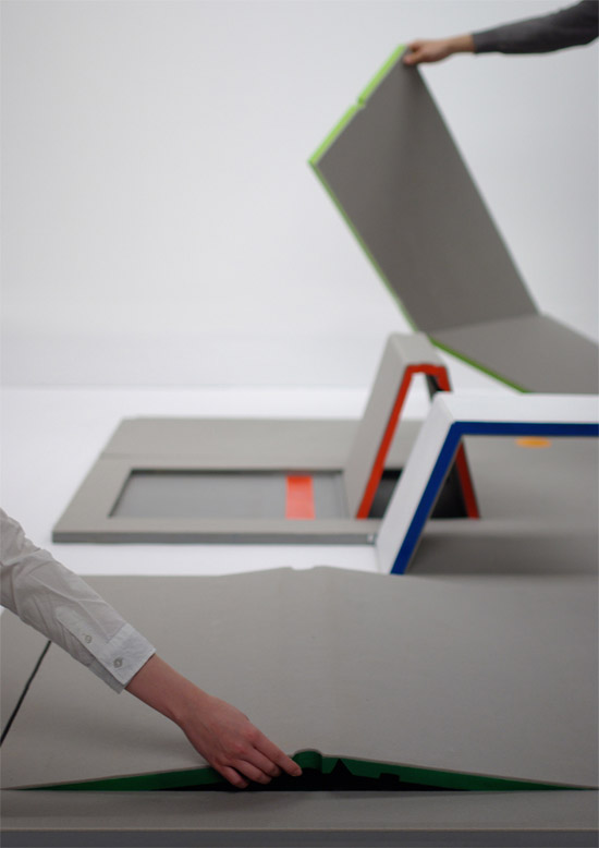
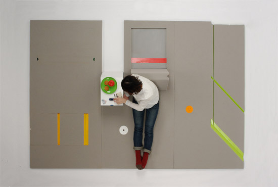
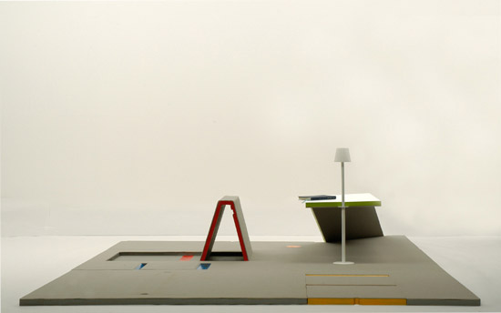
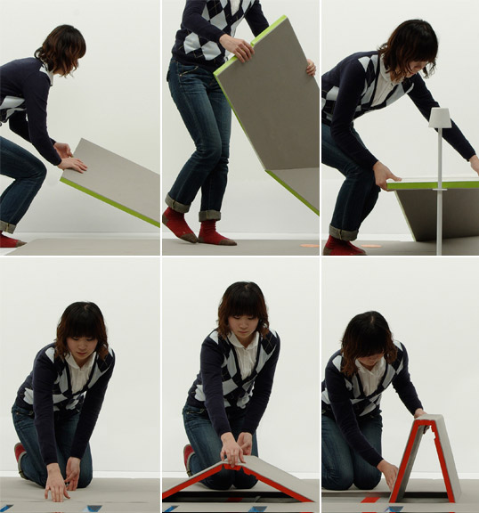
'land peel' is a furniture developed by japanese industrial design student shin yamashita
from the kyoto institute of technology. it is a flat three piece mat set from which a table,
seat or rest can be made simply by lifting the panels. when done using, the furniture can
be discreetly tucked away.

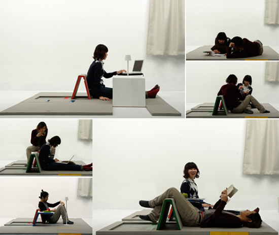
the flexibility of the lounge floor mat makes it ideal for all leisurely activities such as
watching television, studying, lying down, or reading a book.


'land peel'


'land peel'


'land peel' top view


'land peel'


the process of folding out the land peel


different uses of the 'land peel' mat

조명쉐입참고

쉐입참고


image via flickr

kinzo: maygreen interior

숍 인테리어 같은데엔 이렇게 해도 멋지겠는걸..
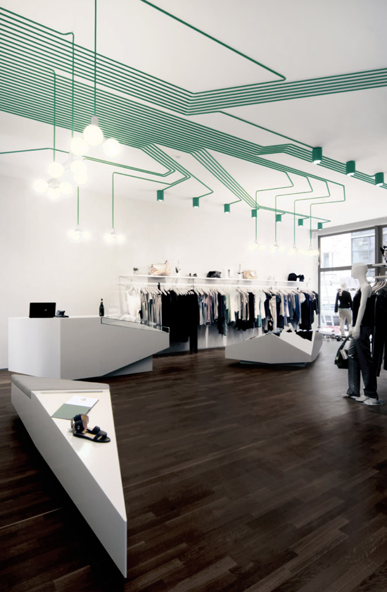
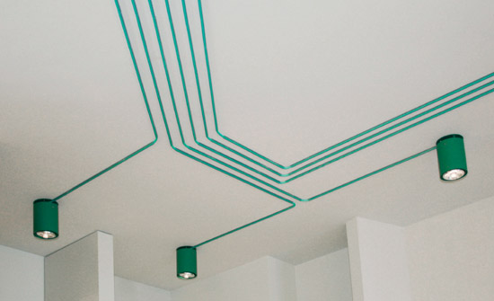
전선 라인을 천정위로 숨기는게 아니라 마치 PCB기판처럼 천정에 배치만 잘 해놔도 아트가 되는구나 ㅎ


'maygreen' retail interior

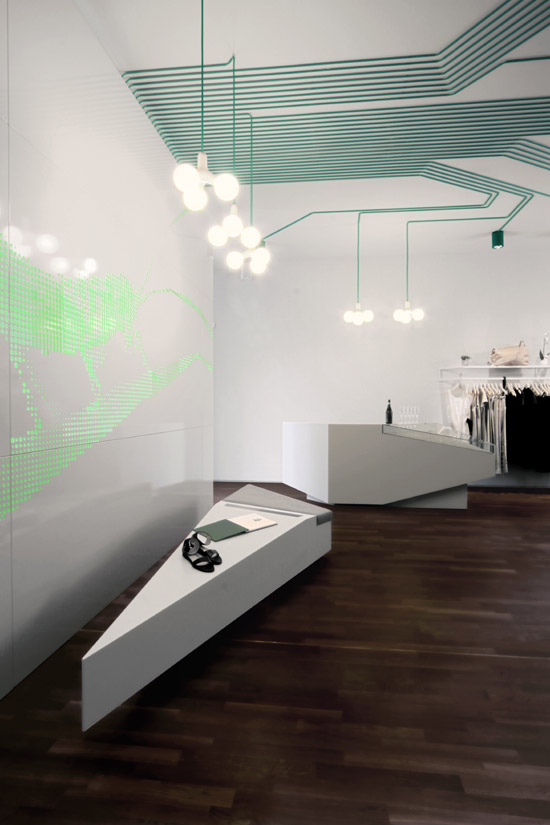
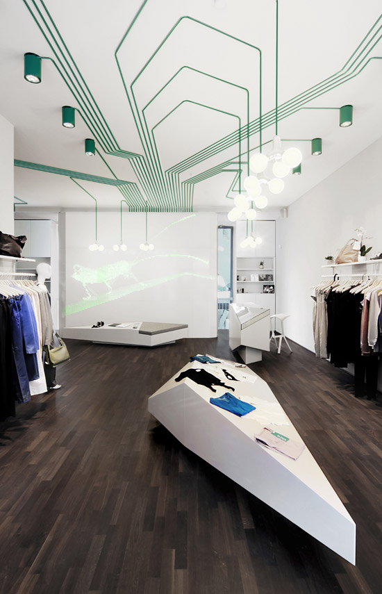
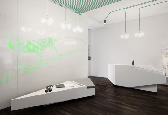
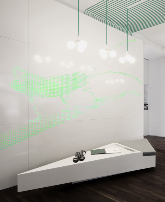
the 'maygreen' interior has been designed by berlin-based design trio kinzo. the core of
the interior design consists of a light installation akin to a computer chip, a giant grass
hopper solely composed of green light, and polygonal furniture that seems to float like
icebergs on the dark oak floor.


'maygreen' retail interior


'maygreen' retail interior


'maygreen' retail interior


detail of polygonal furniture


ceiling mounted light installation

the ceiling-mounted lamps, also created by kinzo, were specially manufactured
for this project by idee.design.licht, the german specialist in individual lighting
solutions.


detail


Hsi Huang's Shopping Bike wins International Bicycle Design Comp

국제 자전거 공모전 수상작들..
매년 느끼는 거지만 자전거 하나에 어떻게 저렇게 많은 아이디어가 나올까 싶습니다.
올해에도 괜찮은 작품이 많네요.

0ibdc001.jpg

I'll never understand why certain fairly major design events don't post their own photo galleries to draw interest for their future events. So it goes with the International Bicycle Design Competition, which was won by Taiwanese designer Hsi Huang for his Shopping Bike, above; it transforms from a bicycle into a shopping cart, providing an on-board storage bin. Even cooler, after Huang submitted his design, the IBDC surprised him by prototyping one in CNC'd aluminum!

Speed Studio Design's got a closer look at Huang's design, which was crowned the winner at the 2010 Taipei Cycle Show (even though the award is considered a "2009" prize). Also be sure to check out their fantastic Flickr gallery showing the other finalists.

0ibdc002.jpg

Andrew Kim's square Coke bottle design

한국인 학생 디자이너가 제안한 패키지 디자인.
미국에서 반응이 매우 좋은가 봐요. 기사까지 뜨고~ ㅎ
아이디오또한 참신하네요~


0andkimcoke01.jpg

CCS student Andrew Kim's Coke bottle redesign is an ambitious take on the iconic bottle, going square in the name of eco-friendliness. The new bottle shape would take up far less space in shipping pallets per bottle, and a push-up in the bottom large enough to accommodate the cap of the bottle beneath it would enable stacking. Said cap is offset for better drinkability.

0andkimcoke02.jpg

Another interesting design feature is that underneath the label, the bottle is ribbed so that it can compress like an accordion, taking up even less space when it's time to go into the recycling truck.

0andkimcoke03.jpg

As a former structural package designer myself, my first thought was that the strength needed for stackability wouldn't jive with a crushable bottle, but then I realized the bottle could be designed so that it's strong when surrounded on all sides--like when they're being shipped en masse--but collapsible when the bottle is alone, absent the pressure of surrounding bottles. Good stuff, and even more impressive considering Kim is a freshman!

via the dieline

(more...)