2009년 11월 26일 목요일
2009년 11월 7일 토요일
Linking mugs


I can't seem to find a way to describe these "link mugs" without venturing into uncomfortable sexual metaphors, so I'll just let the photos speak for themselves. So you can, you know, carry a bunch of them at once. [via Slippery Brick]
Read more | Permalink | Comments | Read more articles in Gadgets | Digg this!
five Cyclops watches by Mr Jones Watches to be won

Dezeen have teamed up with Mr Jones Watches to give away five Cyclops watches. (more…)
New Duravit PuraVida Line
암튼 아래 디자인은 모르는 사람이 봐도 단순한 형태가 멋지다..

Duravit collaborates with Phoenix Design and fittings manufacturer Hansgrohe to launch PuraVida, a new line of bathroom furniture that makes me drool. In fact, I think when they were designing it, they tested to see how high it was on the drool scale, and — yep! a 10.
You can always count on Duravit for modern, clean lines and elegant bathroom furniture. This collection has more flowing curvy lines than their other collections. The pieces are available in deep red or classy black paired with high-gloss white, ebony or aluminium.


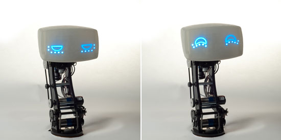
MIT's AIDA project

the AIDA project (affective, intelligent driving agent) is a driving navigation system with a robotic interface
that goes far beyond turn by turn navigation. the project is a collaboration between, volkswagen of america
and the massachusetts institute of technology (SENSEable city lab and personal robots group of media lab).
the navigation system stores information about the city, the driver’s routine and a number of other sources.
it combines this with road conditions, traffic and other data to create an ultra intelligent driving assistant.
by knowing more, AIDA can behave more intelligently. the platform even predicts your destination
notifying you of any incidents along the way and proposing alternative routes. one of the best
demonstrations of AIDA’s intelligence is that it will include a trip to the gas station in your route if
your tank is running low.
http://senseable.mit.edu/aida


Industrial Design Portfolio Advice: Back to Basics
디자이너를 위한 포트폴리오 에 관한 조언...
기본으로 돌아가라....

For an Industrial Designer a design portfolio is an essential element in getting employment. There are hundreds upon hundreds of ways that you can construct your portfolio. You could create it in Flash, on the Web, as a hard copy, as a movie – the possibilities are endless if you put your mind to it.
In this article I will be talking about the basics of design portfolio creation that will allow you to create an excellent portfolio, no matter what medium you decide to choose.
In the creation of a design portfolio there are many considerations you must take into account throughout the building of the portfolio. However the overall process can be broken down into 5 main steps.
1. Plan, Plan & Plan.
2. Collect & Curate Content.
3. Design & Layout.
4. Review.
5. Revisit & Refine.
Plan, Plan & Plan

Planning is an important part of creating your portfolio. Since your portfolio is representing you and your work to people who, in many cases, you have never met then it is very important that it is well thought out and coherent. A portfolio should not be thrown together in a rush – which so often happens when that elusive job opportunity pops up.
You can avoid the rush by setting aside time to properly prepare your portfolio before your start searching for any form of employment. If you are a student, start making every project you create portfolio worthy as soon as possible and take time to consider how each one will fit into your portfolio. I know many people probably tell you this, but it is very very true and it will make life much easier come graduation.
The planning stage is essentially about clarifying a few things for yourself. This clarification will guide your decisions as you create your portfolio.
Portfolio Aim - Who is the portfolio for?
A portfolio is usually meant for one of two particular types of people 1. Potential Employers or 2. Potential Clients.
Although a portfolio for either of these types of people may be quite similar, it is an important consideration to keep in mind as these people will be looking for slightly different things in your portfolio.
Purpose of the Portfolio
Always keep in mind the main purpose of the portfolio – to effectively communicate and showcase you and your amazing design work. This affects many aspects of the portfolio, the main one being the design. The design of any portfolio should be understated, and allow your amazing skills and design work to shine.
Tip: A portfolio is a container for your design work, but it is a container that can be tailored to complement the work. Bottom Line – You don’t want the container to be better than the work inside.
Key Questions
Here are some other key questions to think about during the planning stage.
- How will you or how do you want to guide a prospective employer or client through your body of design work?
- How will you convey the right information, without undersupplying or over-supplying information?
- How much do you want to spend? – don’t spend the earth on your portfolio, but don’t be cheap either (spending might include things like printing & binding).
- What is the deadline for having your portfolio ready to present or send to someone?
- How many pieces do you need to show? This might be specified as a requirement in a job application or by a potential client, then again it may not.
- Does the portfolio need to display a broad set of skills or a very particular set of skills?
Tip: Go for Quality over Quantity.
Collect & Curate Content

In a portfolio, like on the web, Content is King. The design work that is actually contained within your portfolio is very important. Your portfolio is (or should be) telling someone a lot about you and what type of designer you are. It needs to be telling them exactly what they want or need to know, especially when you are not there with your portfolio – which is often the case.
Dependant on some of the answers to the questions mentioned in the planning stage you will have a tentative idea of some of the content that you will be putting into your portfolio.
At this stage it is important to gather as many of your relevant projects and design work as you can so you can begin the arduous task of sifting through and deciding what makes it into your portfolio and what does not. Note the use of the words Arduous and Curate. This stage is always the hardest part of constructing any portfolio, thus it is arduous. Curating your work to ‘tell a story’ and guide the viewer through it is very important so that your portfolio presents a coherent message about you and your design work.
Tip: Try out different combinations of your design projects for your folio, spend time considering each combination. Curate it until you find a flow through the work – flow is the point when it seems to fit together and tell a cohesive story.
Key Questions
- What does this particular combination of my design projects say about me and my design work?
- Does it communicate what the target audience might want to see? I use the word audience because your portfolio may be reviewed by more than one person – sometime an entire design team may see your portfolio.
- How many pieces of design work do you need to show to tell your ’story’? I would personally put in 6 – 10 pieces dependant on the work I have recently completed and the prospective job/client. Amount of pieces is always a key area of contention among designers, so go with what you feel is suitable.
Tip: If in doubt, take it out.
Design & Layout

The design of your portfolio needs to thought through quite carefully. The design and layout of a portfolio must do two things:
- Allow your work to shine ,and thus by extension make you shine. Do not create a portfolio that looks better than the work inside!
- It should make you look professional.
Avoid creating something that distracts from the work contained inside. A great example of portfolios that have a multitude of distractions are Flash based folios.
Designers get over excited by the many things they can do in Adobe (formerly Macromedia) Flash – animations, crazy unintelligible menus etc… These flashy bits cause it to take longer to load and serve no useful purpose other than to distract and annoy the viewer.
Unless you are actually a flash designer, then people are not going to look at your folio to see the amazing flash skills you have, they are looking at the actual work contained within. These bells and whistles will severely annoy the extremely busy people (company owners, studio heads or the underpaid HR people) who have the unfortunate job of having to sift through hundreds of portfolios. So if they are in Flash, take a million years to load even on their high speed connection, and they cannot quickly and easily navigate them then you will probably be passed by.
This also applies to portfolios in other mediums that have terrible layouts that distract (overly flashy graphics and colours), are badly designed (there are a few too many badly designed websites that showcase design work) and are not easy to figure out (sure get creative with your portfolio presentation, but if someone has to read a manual to figure it out, forget it they have already moved past yours!). Make your portfolio clear and simple. It MUST communicate, not confuse.
Remember simplicity does’t mean you don’t take time to put some effort into designing your portfolio or that you don’t explain yourself. Simplicity means you create a considered and appropriate design, and then take away all the superfluous crap that is not truly needed to communicate you and your work.
Multiple forms of media
These days it is also common for people to have a portfolio across a variety of media, the most basic and obvious being print and web. Don’t put all the effort into one and neglect the other.
Make sure that no matter how many mediums you are putting it into, that the portfolio design is as consistent across the mediums or that they complement each other as much as possible*. These days those looking at portfolios are likely to see a web and a print one, its nice if they obviously have a consistent look and feel so that the portfolios speak to them in a similar way about the work inside.
*Note: This is of course not always possible when using a service like Coroflot. But the great thing is that they have already provided a portfolio container that does a lot of things that your portfolio container needs to – its understated, clear, simple, sort of elegant. But remember it doesn’t do everything.It is just a cookie cutter approach to allow you to get up and running quickly at no cost.
Tip: If you are not skilled in graphic design, page layout, web design or what ever medium you want to use, then find someone who is to help you with the design and layout of your portfolio in that medium.
Cost
Cost is another major point of contention among designers when discussing portfolios, so I will be brief.
Spend what you think is reasonable and what you can afford. If you cannot afford a lot use that designer brain you have and treat it like a design problem, come up with a creative solution that meets all the requirements previously talked about. Don’t go overboard (your portfolio doesn’t need to be gold-plated or hosted on a Nitro Mediatemple hosting package), but don’t be stingy (make it look professional, shitty photocopied pages don’t look professional!).
Key Questions
When you execute the design of your portfolio the types of questions you should ask yourself are the same questions you should ask when you are designing a product.
- Does this actually need to be there? (e.g.: a little hovering thing next to the cursor in a Flash portfolio)
- What reason is there for it to exist?
- Does it serve a purpose? Or is it just a bell & whistle designed to distract?
- Does it actually look good?
- Does it communicate?
- Is it an effective and appropriate design or design element?
Review

Get someone to review your portfolio. You should take your it and show it to your peers, and anyone else who you think will provide you with excellent feedback on your portfolio.
Your peers might include (dependant on your situation) fellow students, lecturers, work colleagues, friends or family. Anyone else could include people you are aquatinted with in your part of the design industry.
For example you might, through your networking (which is an essential for any designer), be aquatinted with the senior designer at a local design studio (if applying at that particular studio then be careful about asking for a portfolio review, personally I might find someone else to ask for a review who knows what that studio is like).
Bounce this acquaintance an email which politely and courteously asks them if they will take some time to sit down and talk with you about your portfolio OR if they will review it via email/phone.
DO NOT attach a digital copy your portfolio to this email, the reasons for this are two fold.
They do not want any more attachments clogging up their email inbox – especially if they decide they do not want to or have the time to review your portfolio.
The second reason is that if possible you want to talk with them in person. If you were to send them your portfolio in the request email they are more likely to do a short, possibly unconsidered review (this is not always the case, but for busy people you could visit it person it usually is) via email.
Having your portfolio reviewed in person is excellent as it allows you to do several things at once.
1. If the person is an acquaintance then you are provided with a chance develop and further the relationship.
2. You will also get a more in-depth review because the person will in be forced to actually take the time to review and provide feedback directly.
3. You will also pick up on more subtle reactions - often facial reactions, but also changes intone of voice and the particular words used – that you would NEVER be picked up via email or over the phone.
4. Its more personal.
Getting a Face to Face Review
Getting a face to face with senior design professional can be difficult. As they are of course busy and they probably receive similar requests more often that you can imagine. Sequence things should occur – email, potentially a phone call, possibly a follow up email, then if everything goes well a meeting.
GOLDEN RULE : DO NOT be rude, always be extremely courteous and polite. They are doing you a favour.
Be bold and direct – ask for what you want, in other words don’t dilly dally around making small talk about the weather.
When writing an email, if you have met them previously be casual polite (i.e you could open the email with ‘Hi John’). If you do not know them and this is first contact be proper and polite (i.e. ‘Dear John’) and introduce yourself (i.e ‘My name is Jane Jones I am writing to you because……’).
Keep the emails short, punchy and too the point.
Ask for 1 hour. You may not get it, you may only get 30mins or 45mins. But always ask because you might. An hour is a good amount of time as it allows time for the person to be late, for the review and a bit of chit chat and a coffee. If they are willing only to give you say 15 mins, then politely decline and explain why you need at least 30mins to 1 hour. If they still won’t let up then move on and find someone else to ask.
Pick some dates and times that suit you and suggest them to the person, ask if any of these dates or time suit them and negotiate from there. Be flexible they are busier than you are.
If you want to visit the studio, ask to meet them there, but try to make sure you have the meeting a nearby quiet coffee shop. The reason for this is that it takes them out of their work environment where they may be easily distracted by work things. Eg: if other staff know its not a client meeting they may ask for opinions from this person – which will eat into your meeting time.
Once you have had the meeting and the portfolio review follow up by sending a thank you email.
Tip: ALWAYS be courteous and polite about criticism. DO NOT burn bridges (translation: don’t piss them off) you never know what you might might happen in the future.
Key Questions
Here are a few basic starting questions to ask anyone (or even yourself) who is reviewing your portfolio.
- These are the skills I want to convey, INSERT SKILLS HERE (e.g., Excellent attention to detail), do you feel that my portfolio conveys this?
- Does this all make sense to you without me having to explain it? If I wasn’t here would these projects make sense to you?
- If no (to the above question), then how do you think I could make sure they are conveyed effectively?
- Does the Design of my portfolio compliment the work inside or does it over shadow it?
- The purpose of this particular portfolio is XXXX do you think that it is suitable for this purpose?
Revisit & Refine

There are several likely scenarios after you have had a few people review your portfolio for you (scenarios 2 and 3 are probably most likely, and ideal).
1. You need to go all the way back and start from scratch – hopefully not, but it could be the case.
2. Your need to review the overall portfolio and then refine it.
3. A few small areas need fine tuning and refining.
4. That senior designer that reviewed it thought it was so good that he offered you employment and you no longer need to use the portfolio for that other job you were going for (You never know who might see your portfolio and offer you employment!).
Wrap Up
Keep in mind you will need to revisit, update and refine your portfolio regularly. I would say it is ideal to revisit every 3 – 6 months, but this is dependant on your situation and it might occur at different times for different reasons.
Reasons could be:
- You create some new work you feel needs to be in your portfolio.
- You have a particular job you want to apply for, so you revise and update to match the requirements of that job.
- You want to change jobs, are retrenched or are fired from your job.
- You get sick of the portfolio and design you have, so you start from scratch.
Tip: Look after your portfolio and keep it safe and dry, don’t show a portfolio around that has coffee stains all over, is ripped or looks like it has been for a trip through a sewer.
Good luck with your portfolio and I hope that some of the tips and advice above helps you create one that you will be proud to show around, but more importantly will get you employment.
Additional Resources
While I hope I have covered some of the most important aspects of portfolio creation in this article, not everything can be fitted in. Here are a few additional resources that might help you create an excellent portfolio.
Online Folio Solutions Series – A review series written last year on Design Droplets about various online portfolio hosting solutions.
Why You Should Start Your Portfolio Now – As always, great advice for design students over at Core77.
Advanced Portfolio Tips - Now you have some basics down, why now get into the advanced stuff?
Creating A Successful Online Portfolio - Taking your portfolio online, then be sure to read this one from Smashing Magazine. It also covers some nitty gritty of portfolio creation.
Please take time to leave your thoughts or feedback. Got some tips of your own? Or maybe a question? The comments section is waiting below for you.
"Living With" product review: Knoll's Generation chair
KNOLL 의 새로운 의자 디자인에 관한 이야기..
Remember the hot girl (or guy) in your high school? If they had a sibling, that sibling was almost never hot, and didn't try to be; they realized the incumbent had the hot thing locked down, so they went in a different direction. Siblings of the hot were really witty, and told great stories, and knew where to get booze for the party, and in general were more fun to hang around with.
That's basically Knoll's Generation chair. With competition like the Aeron and the Embody, the Generation strives to do the things those chairs cannot, and succeeds at them. Whether or not those things are things you desire in a chair depends largely on how you sit, or don't sit.

We spent every day for just over a month testing out the Generation, and here are our findings.
Overview:
The first thing you notice about the Generation is its matrix-like backrest, made from high-performance elastomer. It bends and flexes in varying degrees according to the location and size of the carefully-placed perforations. There is a pleasing but not excessive amount of give, well-calculated enough that it makes you feel you're sitting in something expensive.


The second thing you notice is the armrest supports, or rather their absence; instead of coming straight down from the armrests, they wrap around to the back of the chair, meaning you can sit in this chair completely sideways, leaning against the backrest with your side, and there's plenty of room for your legs under the armrest. Despite this added feature, the armrests still provide good support and are easily height-adjustable. It's easy to get them into just the right position with a minimum of fiddling.

The seat bottom is predominantly flat and pan-shaped and accommodates this sideways posture; the entire periphery of the seat bottom actually flexes downwards when pressure is applied to it, curling it into an impromptu and supportive lip.

But the great magic trick of this chair is the top of the seatback. The matrix has been designed in such a way that it bends back upon itself when pressure is applied to it, allowing for extreme lean-back stretching, an armrest when you turn to speak to someone behind or to the side of you, and a comfortable headrest when you slouch down in the chair. I cannot say enough good things about this feature, and I often activated it for its own sake. It actually makes the chair fun to sit in, though fun isn't something we often equate with office furniture.

I should point out that the flexibility in this chair does not come from flimsiness; the chair can look deceptively flimsy in some of the smaller press photos, and when seeing and sitting in the real deal I was surprised to find it sturdy and well-built. The flexibility, in short, comes from careful and thoughtful engineering, not thin plastic.
Actual Usage
The personal, long-term appeal of the Generation will depend on how you sit. I work from home and spend much of my days and nights at the desk-chair-laptop combo, doing work during daylight hours and lounging and movie watching in the same location at night. During work, my fingers always need to be on the keyboard and mouse--I'll rarely, say, read a PDF for more than 30 seconds and not need to be typing something from it--so during work hours I mostly sit in a normal, frontward facing position, in various states of recline, and do not have the opportunity to make use of the Generation's 360 seating possibilities. It's not easy to type while sitting sideways on it, for instance; that feature is probably intended more for when you're conversing with co-workers, which I do not have. The Generation chair is designed for offices that have more of a social-interactive nature to them.
For me as a solitary worker, I found the Generation a Godsend mostly at night, or during leisure time when I had no need to type, and I'd happily sit in it sideways--both leaning sideways against the backrest, or leaning slightly back, throwing my legs over one armrest and adjusting the other to support my lower back, although the edge of it cutting into your back doesn't enable this latter position for as long as the former position. I also discovered you can turn the chair around completely, Rog-from-What's-Happening-style, and the sensation of having the front of your body supported by this mesh matrix is both unusual and comfortable in a very novel way. (In this position all I'd need is a masseuse behind me and I'd be in heaven.) This is an absolutely fantastic chair to watch movies in.
Problems and Criticisms
I only had two minor gripes with the chair. The first was with the material chosen for the backrest; it has a certain amount of "tack," or friction, to it, and often when sitting in the chair and leaning back or shifting slightly, the backrest surface would pull my shirt up in the region of the lower back. If I was wearing a shirt that was tucked in, I'd need to readjust it every time I stood.
The second is the pan-shaped seat bottom, filled with what feels like dense foam. Having been spoiled by Aerons, Embodys and the like, I was not used to the "dead spots" you feel when sitting in the same position on a firm foam surface for long hours. It requires you to move to get the circulation going in that particular spot, rather like in an airplane seat. But I feel compelled to point out that this is no different than any other chair with a foam seat, and I understand, from a design perspective, that the flat shape is required to enable sideways seating (try sitting sideways on the Aeron, for instance, and the rim of the seat support will bite into your lower thigh). Whether or not you consider the trade-off worth it will depend largely on how much you will shift in the chair and use its manifold positional possibilities.
Conclusion
The sturdy, flexible-in-multiple-ways Generation is not like any other chair I've sat in, as it truly does let you "Sit how you want," which is the chair's catch-phrase. If you work in an open office and have the opportunity or need to frequently interact with those around you, this chair will probably suit you well, and fidgety change junkies will feel like the Generation has dropped out of the sky. Constantly forward-facing, solitary workers will want to give it an extended test-sit first.
Video of the Design Process

The Generation was designed in collaboration with New-Zealand-based Formway Design, and you can check out a video explaining the design process here.
Designer Salary Survey: The results are in!
CORE 77에서 조사한 디자이너 연봉에 대한 리서치..
결과만으로보면 돈 많이 버는 분야는 디자인경영이랑 인터랙션 디자인이네..
우리나라에서도 조사하면 아래와 같을까?

The numbers are in, and they are both great and terrible. Coroflot's Designer Salary Survey, now in its ninth year (true!), broke the 5000 response barrier this time around, with strong showings from every design field that calls the site home. The findings are a combination of expected and astonishing.
First, the expected:

Salaries took a tumble this year, almost across the board: the Design Management and Interaction Design fields in particular saw their meteoric 3-year rise come to a sharp and dramatic end, though they're still the highest paid among the eight fields covered. Other disciplines saw gentler declines, with the peculiar exception of Fashion and Apparel, which bucked the downward trend in a big way, showing a nearly US$3,000 increase over last year. Fashion also bucked the experience trend, with mid-level designers in the field out-earning their more venerable counterparts:

Graphic and Interior designers continue to languish at the bottom of the pay scale, and those very few web designers who've been at it since the beginning (Mosaic, Hotbot, blinky text...ah the mid-90s) are making an absolute killing.
Here's another noteworthy shift from last year:

Corporate design studios are losing their dominance. While last year's survey showed more than 60% of respondents working in-house in every field but web design, this year flips that around: all but two fields saw the in-house fraction drop below 60%, with the Freelance and Consultancy categories taking up the slack. The temping of design, it appears, accelerates during dark financial days.
This is just scratching the surface though. For lots more analysis, including regional and international comparisons, salaries by job title, and the influence of education on design salaries, plus a customizable database of all Survey results, go to the 2009 Salary Survey Results page on Coroflot. We've broken it down for you into The Six New Realities of Creative Work, and you know you want to read about those.
>>Read the full analysis and see the entire 2009 data set here.
(more...)
radio with motion based ui
이렇게 간단하게 실현해 냈네..
아이디어가 떠오르면 무조건 먼저 질러야해..^^
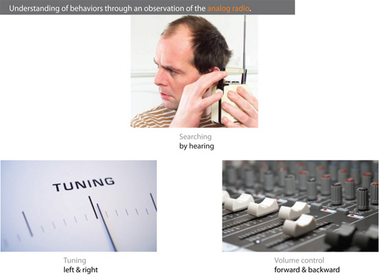
il-gu cha: R1 radio
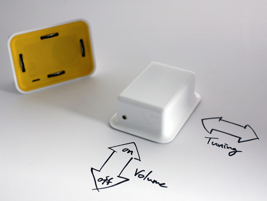
tuning is done by moving the radio from left to right and volume is controlled by rolling the radio forward and backward
R1 radio by il-gu cha is an analog radio which requires one to tune the radio by physically
rolling it on a surface. studying how people manipulate rather than bury their interactions
with a product, the radio brings about a new kind of behavior between itself and the user.
by using a bevel gear system wheel structure, one can control the radio through
physical movement. the R1 allows users to turn the gadget on or off, and control volume
and tuning simply by physically rolling the radio forward, backward and sideways.
you can view a video of how the R1 functions here.
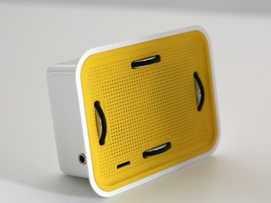
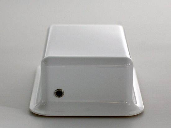
the wheel structure and speaker on the underside of the radio
lukas koh: t-issue
휴지를 쓰는 만큼 숲의 나무는 점점 줄어드는 것을 표현한 휴지박스..
하고 싶은 말을 확실히 보여주는 디자인..

t-issue by lukas koh
for his design 't-issue' korean designer lukas koh plays on an ordinary tissue box,
translating it into an environmentally conscious object. 't-issue' is made
of recycled paper, with the glue which connect the sides made out of natural rubber.
through the tree shaped hole on the side, you can see how much tissue you are using
and how much is remaining in the box. 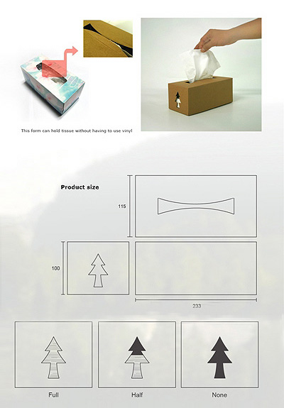
naoto fukasawa: limited edition kaga wall clock
참 단순한데 멋져보이는건 왜일까?
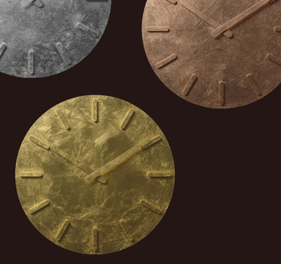
limited edition of kaga wall clocks by naoto fukasawa
naoto fukasawa has created a limited edition of kaga wall clocks for plus minus zero's
flagship store in aoyama. for these special versions fukasawa has used the ancient
tradition of gold leaf, in japan it is now only manufactured in kanazawa city, thus called
'kanazawa leaf' of 'kaga leaf' (kaga is the old name of kanzawa). the simple clock with
no glass or secondhand consists of hour and minute hands which protrude from the surface.
the clocks available in gold, silver and copper are exclusively available at plus minus
aoyama's store or through the website for japanese domestic customers.
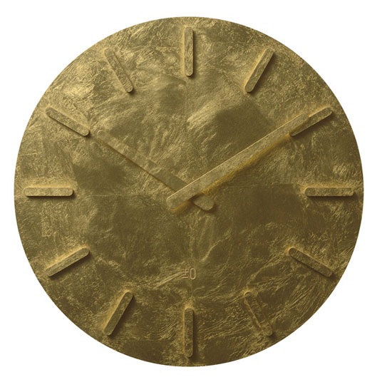
kaga wall clock - gold leaf
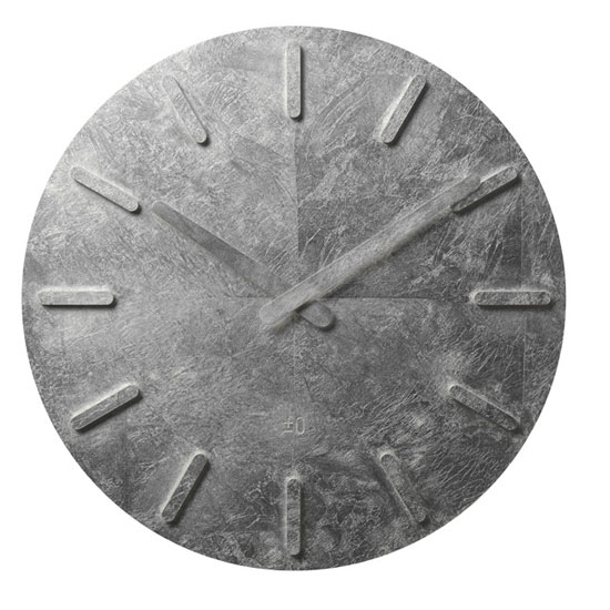
kaga wall clock - silver leaf
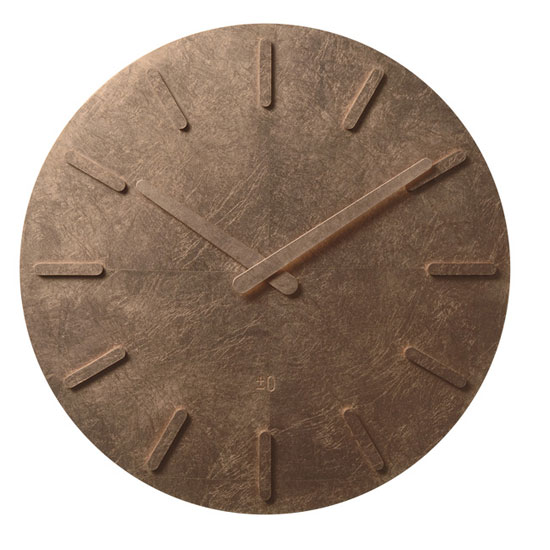
kaga wall clock - copper leaf
2009년 11월 2일 월요일
2009년 11월 1일 일요일
think outside the parking box competition
간단한 아이디어 인데도 이렇게 풀어내니 괜찮네....

'trace' by mario lemos from switzerland, is one of the 66 shortlisted entries from our
from our recent designboom competition 'think outside the parking box' in collaboration
with nissan.
the concept of the parking project is based on the functionality of sundials which indicates
the time according to the position of the sun. trace uses the same system to delineate a
parking space through the use of aluminum poles. meant for parking spaces in sunny places,
the poles are oriented in the direction of sunrise and sunset(wet-east), that reduces or enlarges
the parking space according to time. on sunny days this concept is purely graphical.
the simplicity of the poles become a sculpture, a work of art in a desolate place such as an
urban parking lot. at night, the shadows of the posts are lost in space.


2009년 10월 31일 토요일
빠른 사람이 성공할 수밖에 없는 이유
주저하고 뜸들일게 아니라 과감히 실행하고 깨지고 다치더라도 그 속에서 더 나은 답을 빨리 찾는 게 낫다. 너무 신중한 사람들이 일을 늦게 한다. 아니면 신중하지도 못하면서 일하는 속도가 느리다면 그것은 일 자체를 잘 못하는 사람이 분명하다.
하루종일 바빠 보이는데도 막상 결과물은 별로 없는 사람이 있고, 여유를 가지면서도 아주 많은 결과물을 선보이는 사람도 있다. 둘의 차이는 일하는 스피드다. 몇 시간을 일하느냐가 중요한 게 아니다. 스피드는 업무시간을 줄여줄 수 있다. 같은 보고서를 만드는데 하루종일 걸리는 사람과 반나절 걸리는 사람의 업무생산성과 평가는 다를 수밖에 없다.
빠른 것보다 제대로 하는 것이 더 좋지 않냐고? 그 말도 맞다. 다만 그 말이 맞으려면 정말 확실하게 제대로 해야만 한다. 그렇지 않을 거면 빠른 것이 비즈니스에선 훨씬 낫다. 빨리 해놓고 공유하고 검토받고 다시 수정보완하는 것이 비즈니스 업무에선 최선이다. 빨리하고 놀자는 게 아니라, 빨리해야 완성도를 높일 검토와 수정보완할 시간도 버는 것이다.
자기가 준비하는 내용이 확실하게 자신있는 게 아니라면 상급자에게 빨리 보고하고 수정보완할 점을 지적받는 과정을 거치는 것도 효율적이다. 비즈니스는 혼자서 하는 게 아니다. 팀플레이 하는 거다. 공유하고 검토받고 지적받는 과정을 많이 거치면 거칠수록 내용은 보다 탄탄해질 가능성이 높다. 일하는 속도를 빨리하는 가장 큰 이유가 바로 이것 때문이다.
일을 빨리하는 것은 회사를 위해서가 아니라 자기 자신을 위해서다. 자신의 가치를 키우는 최고의 무기가 바로 스피드다. 일을 빨리 할 수 있으면 이로운 점이 많다.
첫째, 정해진 업무를 끝내고 자신을 위한 투자를 할 시간을 확보할 수 있다. 매일매일 업무에 짓눌려 자기계발을 전혀 못하는 사람들이 많다. 이들은 늘 불안하다. 내일을 위한 준비를 하고 있지 않으니 불안하면서도, 막상 현실에 짓눌려 일상에선 불안할 틈도 없다.
그러다 서서히 도태되어 불안이 현실이 돼버린다. 그러니 우리에겐 시간이 필요하다. 잠 안자고 자기계발할 순 없으니 일을 최대한 빨리해서 자기계발에 쏟자. 매일 야근하고 주말마다 회사일해서는 절대 자신의 내일을 위한 투자는 어림없다. 일을 빨리하는 것은 생존의 문제다.
둘째, 일을 빨리하면 그 일을 다시 되짚어보며 더 꼼꼼하게 수정보완할 여유도 생긴다. 시간 빠듯하게 겨우 일을 끝내는 사람에겐 수정보완이나 재검토할 여유가 있을 리 만무하다. 글은 자꾸 고치고 다듬으면 더 좋아지듯, 보고서 쓰기나 각종 업무의 문서작업도 마찬가지고 기획도 마찬가지다. 업무능력이 높은 사람치고 일을 끝내고 수정보완과 재검토를 거치지 않고 한방에 끝내버리는 이는 별로 없다. 이것도 결국 일을 빨리할 수 있어야만 가능한 거다.
셋째, 일을 빨리하면 사람도 돌아볼 수 있다. 업무를 하다보면 주로 클라이언트나 동료들과의 커뮤니케이션과 인간관계가 중요하다. 일에 치여서 정해진 업무 끝내기도 빠듯하다면 어디 사람 신경 쓸 겨를이나 있겠나. 일을 빨리하면 여유시간이 생기고, 그 시간에 사람들 신경써서 보다 원활한 업무처리환경을 만든다.
넷째, 정해진 업무만 해서는 돋보이기 어렵다. 정해진 업무는 기본이기 때문이다. 일을 빨리 할 수 있으면 기본에 플러스알파를 할 수 있다. 회사를 위한 제언이나, 추가적인 사업아이디어 등 보다 창의적인 기획과 제안을 회사에 하려면 결국 시간이 필요하다. 일을 빨리하면 결국 이런 일 할 시간도 생긴다.
그렇다면 어떻게 하면 일을 빨리 할 수 있나? 가장 먼저 필요한 것은 일에 대한 이해가 높아야 한다. 일을 하다가 잘 모르면 혼자 끙끙대지 말고 자료를 찾아보든 동료나 상급자에게 묻건 그 일을 더 잘 알 수 있는 사람들에게 도움을 받아야 한다. 혼자 머리 싸맨다고 나올 수 있는게 아니라면 최대한 빨리 도움을 청해라.
도움 청하는 것을 주저하지마라. 좀 챙피하고 무안당할 수도 있지만 그런 과정을 통해서도 많이 배운다. 일을 제대로 이해하면 뭘 해야할지, 어떻게 해야할지도 알 수 있다. 일을 빨리 하지 못하는 사람들은 일을 제대로 이해하지 못해서인 경우가 많고, 그러다보니 뭘해야할지 어떻게 해야할지에서 불필요한 시간낭비를 많이 하게 된다. 모르면 물어라. 자료도 찾아봐라. 모르는걸 숨겨선 절대 일의 속도가 늘지 않는다.
두 번째 필요한 것은 집중력이다. 산만하게 이것저것 다 신경 쓰고 담배도 피러갔다 문자도 보내는 사람은 일의 속도가 빠를 수가 없다. 온전히 일에만 집중하고 다른 것을 다 잊어버려라. 짧은 순간이라도 그런 집중을 해야만 진짜 일이 된다. 집중력은 스피드를 올리는 핵심요소다.
그 다음엔 데드라인이 필요하다. 발등에 불 떨어지면 더 잘된다. 모든 일에 마감시간을 정해두고 일을 하라. 무조건 그 시간을 지키도록 하고, 시간 내에 처리된 것만으로 일을 완료시키는 습관을 들여라. 그러면 스피드는 무조건 올라간다. 스스로에게 너무 관대하면 곤란하다. 일할 때만큼은 스스로를 보다 타이트하게 만들어라. 그래야만 일을 빨리하는 습관도 만들어진다.
일을 빨리 할 수 있다는 것은 당신의 미래를 바꾸는 가장 좋은 경쟁력이 된다. 생산성과 효율성이 높은 사람은 더 많은 기회를 누리고, 더 많은 여유도 가지고, 더 많은 성과도 얻게 된다. 그렇다고 날림으로 빨리빨리만 외치진 마라. 내용이 충실한 채 스피드를 높이는 것이지, 스피드 자체가 핵심이 아니다.
성공을 하려거든 실패를 하라!
성공을 하려거든 실패를 하라! : 최고의 강타자들도 10번 중 3번 정도만 안타를 친다
앞서나가는 기업, 앞서가는 개인들의 공통점은 실패를 많이 하는 것이다. 뭔가 잘못된 것 아니냐고? 이해되지 않는다고? 아니다. 실패없이 순탄하게 성공한 사람이나 기업은 없다. 하나의 혁신적인 상품을 만들기 위해선 수많은 실패가 있었기에 가능한 것이다. 자신이 원하는 목표를 위해선 수없이 실수와 시행착오를 겪으면서도 쉼없이 도전하는 사람들이 진정 자신의 목표에 이르는 성공을 맛본다.
성공한 기업과 성공한 사람들일수록 더 많은 도전을 하고 시도를 한다. 하나의 성공을 위해 다수의 실패도 겪는다. 큰 성공일수록 그에 따를 실패도 크다. 산이 높으면 골도 깊은 것이다. 그러니 실패를 두려워 해서는 안된다. 한번의 큰 성공이란 수십번의 작은 실수와 실패 후에 온다는 말이 있다. 따라서 우리는 각자에게 허용되는 수만큼의 실수와 실패의 기회를 누리는 것에 대해 전혀 두려워할 필요가 없다. 실패가 성공을 위한 최고의 과정일 수도 있기 때문이다.
메이저리그의 최고의 강타자들도 10번 중 3번 정도만 안타를 친다. 못친 7번의 시행착오와 실패가 약이 되어 3번의 안타를 만들어낸다고 해도 과언이 아니다. 안타를 만들어내지 못한 타석에서의 실수나 시행착오를 되새겼다가 다음 타석에선 실패에서 배운 교훈으로 안타를 만들어내는 것이 바로 최고의 타자들의 공통점이다. 그리고 홈런타자들일수록 삼진아웃도 많이 당한다. 최고의 홈런타자라 하더라도 실제 그들이 타석에 들어선 숫자에 비해 홈런수는 지극히 적다. 수많은 아웃카운트를 통해 하나의 홈런을 만들어내는 셈이다. 엄밀히 따지면 성공보다 실패의 숫자가 더 많다고 해도 과언은 아니다. 그들이 힘찬 스윙을 통해 홈런도 얻지만, 반대로 헛스윙을 하거나 자신이 바라지 않는 공을 놓쳐버려 스트라이크아웃이 되는 경우도 많은 것이다. 스윙이 크면 클수록 파워는 실리지만 정교함은 떨어질 수 있다. 홈런을 얻으려고 삼진을 감수하는 것이다.
즉, 성공을 위해 실패도 감수할 수 있어야만 성공의 기회는 더 많이 온다. 삼진을 두려워해서 배트를 짧게쥐고 맞추는데 급급하면 안타는 만들어낼지 몰라도 홈런을 만들어내긴 어려우니까. 결국 실패와 성공은 따로 분리된 것이 아니라 함께 있는 것이다. 실패 속에서 성공의 기회도 찾고, 성공을 위해선 실패라는 시행착오도 겪는 것이다.
미국항공우주국 나사에서는 후보자 채용 심사시에 실패 경험을 매우 중요하게 고려하고 있다고 한다. 실패 경험이 없는 사람은 큰 어려움에 직면하면 쉽게 당황하고 혼란스러워 하는 반면, 실패를 해본 사람은 중심을 잃지 않고 차분하게 대처할 가능성이 높은 것이 그 이유이다. 마이크로소프트의 빌 게이츠 회장도 직원 채용 때 실패한 경험이 있는 사람들을 우선적으로 뽑는다고 한다. 실패를 칭찬하거나 부추길 필요는 없으나, 적어도 실패를 통해 쌓은 경험과 새로운 에너지는 중요한 자산임을 인식해야 한다는 것이다. 그러니 조직 내에서도 새로운 시도에 대한 실패를 두려워하는 발상으로는 혁신도 창조도 어렵고, 새로운 기회를 만든다는 것도 어려운 일임을 인식해야 한다.
실패 중에서도 우리에게 필요한 것은 건설적인 실패다. 실패라고 다 같은 실패가 아니다. 도전하지 않고 시도하지 않는 것 자체가 실패이다. 자신의 아이디어를 실행에 옮기는 걸 주저하지 않는다면 건설적 실패를 통해 성공도 앞당겨진다. 아울러 과거의 실패에서 배워라. 실패는 성공 이상의 교훈이다. 같은 실수를 반복하지 않기 위해서라도 실패를 무조건 덮거나 지나치지말고 자세히 들여다보며 평가도 하고 교훈도 찾아야 한다. 그리고 실패에서 좌절하지 말아야 한다. 실패는 과정이다. 안되는 방법을 찾아낼수록 되는 방법을 찾는 확률은 높아지기 마련이다. 그렇기에 실패를 하는 것이 아니라 성공할 확률을 높여가는 것이다. 실패할때 좌절보단 새로운 기회에 대한 동기를 가져야 한다.
혹여, 자신의 계획보다 자신의 현재가 조금 어긋났거나, 몇가지 크고 작은 실패나 실수를 겪었다고 기죽지 말자. 실패는 성공의 필수요소라는 점을 명심하며 늘 도전하고 시도하라. 도전하지 않는 자에겐 실패의 기회 조차도 없으니까.
- 김용섭 날카로운상상력연구소장(www.digitalcreator.co.kr)
[2030성공습관]보고서의 힘
김효준 BMW코리아 사장은 1995년 BMW코리아의 임원 입사 제안을 받고 다른 후보들과 독일에서 면접을 보게 되었다. 대개 최종 면접이 그렇듯, 후보들은 모두 쟁쟁한 사람들이었기에 누가 뽑히더라도 회사로서는 유능한 인재를 영입하는 것이었다. 김 사장은 증권, 보험, 제약 업계를 거쳤지만, 수입 자동차 업계는 처음이었다.
그는 면접장에 다른 후보들과 달리 '한국의 수입차 시장 현황'이라는 80여 쪽짜리 두툼한 보고서를 준비해 갔다. 보고서를 검토한 본사에서는 김 사장을 BMW코리아 상무이사로 영입했고, 그는 2000년에 대표이사 사장이 됐다. 2003년에는 독일BMW그룹의 등기임원이 되기도 했다. 본사 임원 중 유일한 아시아인이라는 것도 특징적이지만 BMW 해외 지사의 사장이 본사의 등기임원이 된 것은 매우 이례적인 일이라고 한다.
김 사장은 초고속 승진의 사례이기도 하다. BMW코리아의 사장이 된 것이 40대 초반이고, 외국계 제약회사인 한국신텍스에서는 30대에 이미 이사와 대표이사를 거쳤다. 남들이 대리나 과장직에 있을 때 그는 이사와 사장직에 있었던 것이다. 과연 그의 성공에는 어떤 비결이 숨어 있는 것일까?
많이 알려져 있다시피 BMW코리아의 상무이사가 되기 전까지 그의 최종 학력은 고졸이었다. 이후 대학을 다니고 박사 학위까지 받았지만, 그의 입사 및 초고속 승진에 그 학력이 작용한 것은 전혀 아님을 알 수 있다.
그렇다면 그의 성공 비결에서 학력은 제외해야 한다는 뜻이 된다. 물론 그가 유독 외국계 회사에서만 일을 한 이유가 학력 때문이기는 하다. 자신의 능력을 발휘하며 가치를 드러낼 곳으로는 학력지상주의 사회인 한국보다 외국계 회사가 유리했기 때문이다.
김 사장이 여러 신문 인터뷰에서 자신의 성공 요인을 물을 때 자주 인용하는 이야기가 있다. 그가 한국신텍스의 경리부 차장으로 있을 때, 당시 미국인 사장이 김효준에 대해 쓴 인사고과 평가서를 우연히 봤다는 것이 그것이다.
사장은 인사고과 평가서에 ‘차기 사장으로서 자질이 있다’고 그를 평가하며, 그 근거로 다방면에 실무 경험이 있다는 것과 지극히 상식적이어서 균형 잡힌 사고와 행동이 안정감을 준다는 것, 커뮤니케이션 능력이 뛰어나 문제 파악과 해결, 설득 능력이 남다르다는 것을 제시했다고 한다.
사장이 평가했던 그의 그와 같은 능력은 매력적인 페이퍼 파워로도 발휘되었다. 그는 '나의 꿈은 Global GEO'(2003)라는 책을 출간한 바 있고, 2007년에는 박사 학위 논문인 '지식 이전의 흡수 능력과 동기 부여에 관한 연구'로 한국국제경영학회에서 우수 논문상을 받기도 했다. 페이퍼 파워는 김효준 사장의 입사, 승진, 경영성과 증대, 그리고 자신의 브랜드 가치를 높이는 데에서 모두 활용되고 있는 것이다.
데이터 저장 장치 전문 업체인 이메이션의 코리아 CEO를 거쳐, 2007년부터 전 세계 이메이션 브랜드를 총괄하는 글로벌 브랜드 총괄 대표를 역임하고 있는 이장우도 페이퍼 파워를 가진 경영자다. 다수의 책을 낸 저자임과 동시에 매체에 칼럼도 많이 기고하는 그는 독서 경영 신봉자이기도 하며, 직원들의 도서 구매비는 무제한으로 지원하기도 했다.
무엇보다도 그의 페이퍼 파워가 발휘된 것은 그가 첫 CEO가 되던 1996년이었다. 당시 그는 한국3M의 부장으로 재직하고 있었는데, 이메이션코리아의 사장 채용 공고를 접하고 3M의 미국 본사 임원에게 ‘내가 이메이션코리아의 사장이 되어야 하는 이유’를 담은 장문의 이메일을 보냈다고 한다(이메이션은 3M의 계열사다).
그 장문의 페이퍼가 그로 하여금 이메이션코리아의 CEO가 되는 데 일조했음은 물론이다. 시의적절한 페이퍼는 매우 강력한 힘이 됨을 다시금 보여 주는 예라 할 수 있다. 실제로, CEO나 임원의 96%가 ‘자신의 보고서 작성 능력이 승진에 영향을 끼쳤다고 생각하는가’라는 질문에 ‘그렇다’라고 답해 보고서 작성 능력이 승진의 필수 요소임을 보여 준 조사 결과도 있었다.
이직을 위해 면접을 보려는 지인들에게 필자는 늘 ‘그 회사에 정말 입사하고 싶다면 그 회사를 분석한 보고서나 그 회사를 위한 제안서 등을 하나 준비해 가라’고 당부하지만, 실제로 실천하는 이들은 많지 않았다.
그러나 김효준 사장의 사례에서 보듯이, 잘 준비한 보고서 하나는 매우 강력한 무기가 된다. 물론 김효준 사장이 능력도 없는데 보고서만으로 CEO가 된 것은 결코 아니다. 하지만 분명한 것은 면접이라는 평가의 자리에서 보고서가 상당한 영향력을 미쳤을 것이라는 점이다.
면접 때 준비해 간 보고서가 주는 1차적인 메시지는 지원자의 태도와 성의다. 면접관 입장에서는 입사에 대한 지원자의 강한 의지와 열정, 성의를 느낌과 동시에, 보고서의 내용에서 지원자의 전문성과 준비성도 가늠할 수 있다. 때문에 지원자 입장에서는 짧은 면접 인터뷰에서는 보여 주기 어려운 실력과 신뢰, 열정 등을 보고서 하나로 강력하게 어필할 수 있는 것이다.
만약 경력직 이직이나 임원급 채용 인터뷰를 해야 할 상황이 된다면 보고서 준비를 절대 잊지 말길 바란다. 당신이 정말 최종 합격자로 선택되고 싶다면 말이다!
김용섭 날카로운상상력연구소장 www.digitalcreator.co.kr
* 머니투데이 <김용섭의 2030 성공습관> 연재 칼럼 중에서.
힐러리가 연설을 잘 하는 비결
탁월한 연설 실력을 가지고 있는 것으로 유명한 힐러리 로댐 클린턴에게는 인용문, 속담, 격언, 성경 구절이 빼곡히 적힌 수첩이 있다고 한다.
언제 어디서라도 정곡을 찌르는 연설을 할 수 있는 그녀의 원동력은 인용할 말이 적힌 수첩인 것이다.
머리 속에 수많은 정보를 시의적절하게 효과적으로 꺼낼 수 있다면 좋겠지만 미리 계획하고 준비해두는 것보다는 덜 미더운게 우리의 머릿속 기억력이 아니던가.
말을 많이 하는 직업을 가진 이들 중에 책을 많이 읽는 사람들이 많다. 책을 읽고 좋은 인용구나 이야기 소재를 노트에 기록하여 그것을 활용하는 것으로 자신의 경쟁력을 삼기도 한다.
특히 인기있는 개그맨이나 사회자 중에는 독서량이 엄청난 이들이 많다. 비단 이들뿐 아니라, 잘나가는 경영자나 정치인, 세일즈맨 등 남들 앞에서 얘기를 하는 기회가 많은 이들일수록 자신만의 이야기 주머니를 만들기 위해 독서를 게을리하지 않는다.
이들에게 책을 멀리하고, 자신만의 이야기 꺼리를 확보해두지 않는 것은 스스로의 경쟁력을 잃어버리게 만드는 요인이기 때문이다. 즉, 이야기 주머니를 가져야할 사람이 그것을 가지지 못한다면 결코 경쟁력을 잃어버려 자신의 가치를 다 발휘하지 못하고 도태될 우려가 있다는 의미가 된다.
말을 잘하려면, 좀더 구체적으로 말해 스토리텔러(이야기꾼)가 되려면, 자신만의 이야기 주머니를 만들어 두는 것이 필요하다. 미리 준비해두고 상황별로 사용할 수 있도록 해야 한다. 이야기는 즉흥적인 스토리텔링이 아니다.
미리 계산된 스토리텔링이어야만 이야기가 가지는 힘을 최대화 할 수 있다. 일부는 머릿속에 기억 시켜서 언제든 써먹을 수 있도록 하고, 일부는 노트에 정리해두고 필요할 때마다 볼 수 있도록 해두는 것이 필요하다. 자신의 이야기 노트에 찾은 이야기를 정리하기만 하는 것이 아니라, 그 이야기를 사용한 장소와 상황, 어떤 반응이었는지도 메모해두면 좋다. 그러면 다음에 그 이야기를 사용할 때 많은 참고가 되기 때문이다.
시사, 문화예술, 스포츠에 대한 이야기 꺼리는 반드시 준비해둘 필요가 있다. 어떤 상대를 만나더라도 쉽게 말을 섞을 수 있는 주제가 바로 이들이다. 한두개 꺼내보고 상대가 관심가질 주제가 보이면 거기에 대해 구체적으로 얘기하다 보면 자연스럽게 공감대가 형성된다.
아무리 딱딱하고 어려운 얘기라도 먼저 공감대가 형성된 사람과는 좀더 쉽고 편하게 얘기할 수 있다. 무조건 첨부터 딱딱하고 어려운 본론부터 얘기하기 보다 상대의 공감대를 맞추는 작업을 하는 것도 대화의 요령이다. 대화는 결국 사람이 한다. 상대의 기분을 고려하고 상대의 친밀도와 공감대를 높여주는 것은 어떤 내용의 대화를 할 때라도 적잖은 도움이 된다.
필자는 중요한 자리에 갈 때면 이야기 꺼리를 미리 생각해서 그것을 적은 메모지를 주머니에 넣고 간다.중요한 프레젠테이션이나 협상의 자리에서는 상황에 따라 사용할 이야기가 필요하다.
무미건조하게 이성적인 메시지만 전하고 나올 수도 있지만, 상황이나 분위기에 따라서는 감성적인 메시지나 재미있는 이야기로 공략할 필요가 있기 때문이다. 주머니 속에 혹은 수첩 속에 이야기 꺼리의 제목이라도 언급되어 있으면 그걸 보면서 자연스럽게 이야기가 떠오를 수 있다.
그리고, 이야기 주머니는 주기적으로 업데이트 해야 한다. 신문 기사, 유머나 인용문, 각종 사례 등 이야기 꺼리로 사용할 것을 한번 만들어두고 계속 쓰는 사람들이 있다. 이야기에도 유효기간이 있다. 10년 전에는 유머로 용인되던 것들이, 지금은 성희롱이나 시대착오적인 가치관이라 지탄받는 것들도 있다. (www.digitalcreator.co.kr)
재미 이론 (The fun theory)
윈도우 필수 프로그램을 한방에 설치하는 웹서비스 Ninite
컴퓨터를 포맷하게 되면 기존에 쓰던 프로그램을 모두 새로 설치해야 하는 과정이 여간 부담되는 게 아닌데요. 이런 귀찮음을 해결하고자 보통 고스트 같은 디스크 백업 프로그램을 이용하거나 배치 파일을 이용한 나만의 유틸리티 팩을 만드는 등의 작업을 하죠.
근데 이번 윈도우 7 업그레이드처럼 새로운 운영체제를 설치하게 되면 일련의 호환성 문제 때문에라도 위와 같은 꼼수(?)를 쓰기가 사실상 어려워지고 어쩔 수 없이 모든 소프트웨어를 하나 하나 설치해야 하는데요. Ninite라는 웹서비스를 쓰면 이런 고통스러운 과정이 어느 정도 해결될지도 모르겠습니다.. ㅎ
Ninite는 윈도우 버전의 Apps Store를 표방한 웹서비스로 유명 PC 애플리케이션을 편리하게 설치할 수 있는 인터페이스를 제공하는데요. 설치하고자 하는 프로그램만 웹사이트에서 선택하면 나머지 과정은 Ninite의 설치 툴이 알아서 대행해 줍니다. 대부분 끼워 넣기 형식으로 제공되는 툴바처럼 유저들이 원하지 않는 소프트웨어도 기본적으로 차단해 주고요.
1. 설치하고 싶은 애플리케이션을 선택하고 Get Installer 버튼을 클릭합니다. (각각의 애플리케이션 밑에 설치할 수 있는 버전 넘버가 보입니다.)

2. 다음 단계에서 설치 툴을 다운로드 받아 실행하면 이전에 선택했던 애플리케이션의 다운로드와 함께 모든 설치가 자동으로 진행됩니다.


3. 설치가 완료되면 시작메뉴에 프로그램이 깔끔하게 등록된 걸 볼 수 있습니다. 뭐 하나 건드릴 필요 없이 한방에 설치되니 정말 편리하긴 하네요.. ^^;


다만 제공되는 프로그램이 모두 영문이라는 점과 프로그램 설치 경로가 모두 기본값으로 고정이 되어 있다는 점 등이 단점이긴 합니다.. –_-;
Ninite에서 제공되는 프로그램 종류는 다음과 같습니다. 자랑스런 국산 프로그램인 KMP도 포함되어 있다는.. :)
- 브라우저 : Chrome, Firefox, Safari, Opera
- 메신저 & 커뮤니케이션 : Skype, Pidgin, Windows Live Messenger, Google Talk, Thunderbird
- 미디어 : iTunes, Songbird, Hulu, VLC, KMPlayer, AIMP, Audacity, Spotify
- 이미지 : Paint.NET, Picasa, GIMP, IrfanView, XnView
- 문서 : 오피스 (시험판), OpenOffice, Adobe Reader, Foxit Reader, CutePDF
- 안티바이러스 : Microsoft Security Essentials, Avast Antivirus Home, AVG Free Anti-Virus
- 런타임 : Flash Player, Flash Player (IE), Java JRE, .NET Framework, Silverlight
- 파일 공유 : uTorrent, eMule
- 기타 : Dropbox, Evernote, BumpTop, Google Earth
- 유틸리티 : ImgBurn, CCleaner, Launchy, Revo, Defraggler, RealVNC, CDBurnerXP, Recuva
- 압축 : 7-Zip, WinRAR
- 개발자 툴 : Python, FileZilla, Notepad++, JDK, WinSCP, PuTTY, Eclipse