앞으로는 이처럼 개인용 휴대 건강기기들이 많이 나올듯..
어느 회사든 미리 선점해서 출시하면 대박날거 같은 제 생각.......

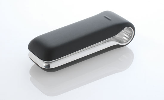
the fitbit is small digital clip which tracks its user’s movements and actions to help manage exercise,
nutrition and sleep routines. the device contains a 3d motion sensor that accurately measures movement
in three dimensions. fitbit keeps track of calories burned, steps taken, distance traveled and even the
user’s sleep quality. this data is recorded and made available to the user through a interactive digital
interface. the device can be worn a number of ways either clipped onto clothing or attached to
a wristband. the device takes its design from the humble clothes peg and features a small OLED
display on its front, which can display some details directly to the user. the device syncs with a wireless
base station that incrementally uploads the data in the background. the device was designed by
newdealdesign, a studio with experience in the digital product design field. designboom interviewed
newdealdesign’s founder and principal designer gadi amit to reveal some of the design thinking that
went into the fitbit.
http://www.fitbit.com
http://newdealdesign.com

what aspects of the fitbit design was newdealdesign involved in?
newdealdesign was involved with the initial 'look and feel' of the website, initial ideas about the brand
identity design, user-interface, including icons and fonts to be used on the OLED display as well as all
the industrial design and packaging design. we even brought in the engineering and manufacturer to
provide fitbit with complete end-to-end solution.

how did you approach the design of the fitbit?
initially we worked on a more 'non-techy' feel for the whole company. we wanted something that has
no gadget feel. we illustrated web-sites and brand identity that was geared towards urban women and
was emotional in approach instead of beneficial or technical in approach.
our process combined a lot of layout of configuration study at the beginning. we had the intention to
make the product into a digital jewelry that will fit urban women in their daily life. since half of our
designers are women, much of the discussion went into 'where do I place it when I ran, or when I go
to bed, or go out for a dinner?'. it was quite a discussion since we experimented with forms that fit
bras in certain locations as well as shorts, dresses and more. the male designers where quite intrigued.
this experimentation led to the clothes-peg for and that led to complete rework of the electronics into
two nodes. this was the main discovery that drove the design. details followed, including the notion
of seamless front, where the display is hidden behind a frosted, rubberized cover. that led to the OLED
user-interface since that type of screen generate much light intensity and allows us to project the icons
from behind. GUI development was needed since the low-cost component we found had no GUI
support. that's very much the process.

how did you approach designing a product with no real precedent?
we approached this project like many of our other projects. being a new type of object requires the
same cultural groundings and the same savvy approach to technology we use routinely. we always
try to frame the object as a tool for regular people. with that in mind, we must think about the daily
use, life cycle and real-life situations instead of, say a gallery object. this means that practicality
drives the object as much as aesthetics. in this case, practicality (attachment to women's clothes)
drove the form and created the core idea, the clothes-peg. so what we do is essentially using
practical thoughts as sources of form-giving inspiration.
could you describe your favourite design element in the fitbit?
I think the clothes-peg profile is very unique and takes the product away from normal tech-gadget
appeal. it also allows for better fit and slimmer form against the body. I think its iconic and made
the design the success it is.


어느 회사든 미리 선점해서 출시하면 대박날거 같은 제 생각.......

the fitbit is small digital clip which tracks its user’s movements and actions to help manage exercise,
nutrition and sleep routines. the device contains a 3d motion sensor that accurately measures movement
in three dimensions. fitbit keeps track of calories burned, steps taken, distance traveled and even the
user’s sleep quality. this data is recorded and made available to the user through a interactive digital
interface. the device can be worn a number of ways either clipped onto clothing or attached to
a wristband. the device takes its design from the humble clothes peg and features a small OLED
display on its front, which can display some details directly to the user. the device syncs with a wireless
base station that incrementally uploads the data in the background. the device was designed by
newdealdesign, a studio with experience in the digital product design field. designboom interviewed
newdealdesign’s founder and principal designer gadi amit to reveal some of the design thinking that
went into the fitbit.
http://www.fitbit.com
http://newdealdesign.com

what aspects of the fitbit design was newdealdesign involved in?
newdealdesign was involved with the initial 'look and feel' of the website, initial ideas about the brand
identity design, user-interface, including icons and fonts to be used on the OLED display as well as all
the industrial design and packaging design. we even brought in the engineering and manufacturer to
provide fitbit with complete end-to-end solution.

how did you approach the design of the fitbit?
initially we worked on a more 'non-techy' feel for the whole company. we wanted something that has
no gadget feel. we illustrated web-sites and brand identity that was geared towards urban women and
was emotional in approach instead of beneficial or technical in approach.
our process combined a lot of layout of configuration study at the beginning. we had the intention to
make the product into a digital jewelry that will fit urban women in their daily life. since half of our
designers are women, much of the discussion went into 'where do I place it when I ran, or when I go
to bed, or go out for a dinner?'. it was quite a discussion since we experimented with forms that fit
bras in certain locations as well as shorts, dresses and more. the male designers where quite intrigued.
this experimentation led to the clothes-peg for and that led to complete rework of the electronics into
two nodes. this was the main discovery that drove the design. details followed, including the notion
of seamless front, where the display is hidden behind a frosted, rubberized cover. that led to the OLED
user-interface since that type of screen generate much light intensity and allows us to project the icons
from behind. GUI development was needed since the low-cost component we found had no GUI
support. that's very much the process.

how did you approach designing a product with no real precedent?
we approached this project like many of our other projects. being a new type of object requires the
same cultural groundings and the same savvy approach to technology we use routinely. we always
try to frame the object as a tool for regular people. with that in mind, we must think about the daily
use, life cycle and real-life situations instead of, say a gallery object. this means that practicality
drives the object as much as aesthetics. in this case, practicality (attachment to women's clothes)
drove the form and created the core idea, the clothes-peg. so what we do is essentially using
practical thoughts as sources of form-giving inspiration.
could you describe your favourite design element in the fitbit?
I think the clothes-peg profile is very unique and takes the product away from normal tech-gadget
appeal. it also allows for better fit and slimmer form against the body. I think its iconic and made
the design the success it is.


댓글 없음:
댓글 쓰기