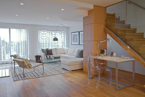
In Toronto’s well-known Designer’s Walk mixed-use complex, this conversion of an outdated, two-story apartment into a condominium took its inspiration from its unroofed central courtyard. With the courtyard as the central element, the unit is clearly defined and feels wide open and airy. The units were built in the mid-1970’s as rental units in a mixed use residential/commercial development.
The palette is muted, with white walls and honey-blonde oak flooring, but not boring — it reflects the light and makes the space feel calming and harmonious. The beautiful feature wall of rubble stones continuously from the kitchen, to the exterior courtyard and back inside to form the wall of the dining room. It adds texture and breaks up the clean lines and solid colors of the walls, cabinets, and flooring without breaking free from the horizontal design.
Upstairs, a large, open space was transformed into a bedroom, bathroom, and walk-in closet. On the lower level there is also a storage unit.


언제 돈벌어 이렇게 꾸미고 살까? ㅎㅎ
답글삭제