2010년 12월 30일 목요일

affectual chair

affectual chair: "

가구디자인할때 결합부를 아예 이처럼도 만들수 있구나..
참고 할것!


By Shawn Weiland. The chair disregards any superfluous or decorative elements for a purist formal language which insists on the materials and the form being directly related to its func- tional uses. Each element of the design looks at how to achieve the most out of the least. The functional attributes of the chair: ergonomics, durability and aesthetics play a vital role in morphogenesis, the creation of form. The angled sides of the seat wrap around the user, stabilizing and enclosing, morphing the chair and user into a single affect. The displaced veneer from where the metal penetrates becomes handles to move the chair as well and grips for the user when seated. The dual leg support on the back of the chair acts as lateral support, replacing any need for cross bracing. Using the minimalist philosophy of reduction to the point where there are no external signifiers, the user must project themselves into the design in order to discover with the chair, promulgating the emotive and experiential qualities that the design creates.


click here for more

-joel


"

Stickpecker

Stickpecker: "

요즘에는 이런 복잡하지 않은 감성적인 디자인이 좋아진다.
1

From the website:

...........................

In Japan there is a "my chopsticks" movement because the wooden disposable chopsticks are a waste of resources.

But people miss the feeling when they pull them apart.

2

That ritual is the starting sign of the meal.

"Stickpecker" is a solution for that.

The magnet resembles the feeling of pulling apart wooden chopsticks.

4

Also the woodpecker and wood design remind you of a peaceful forest that you are protecting at that very moment.

You can say goodbye to the wooden ones.

Acrylic.

...........................

3

¥3,570.
"

2010년 12월 29일 수요일

Anamorphic Architecture, in a Seoul Storefront, Plays with Projected Dimensions

Anamorphic Architecture, in a Seoul Storefront, Plays with Projected Dimensions: "
언젠가 써먹어야겠다 스크랩!
An unseen, imagined world is becoming as accessible to today’s generation as the typewriter or graphite pencil was to a generation before. Geometrical theory, in two and three dimensions, has been illustrated for many centuries. But now, we can play with those geometries in our own finite world, as liquid and changeable there as they can be in the mind. How any kid (young or old) could fail to fall in love with the geometric discipline now is beyond me.

The work above is just one glimpse of that world, a subtle and informal one staged by a studio class in a small gallery storefront in Seoul, Korea. But, of course, it’s also one work in a bigger picture. I spent today puzzling over coordinate spaces and computational geometric theory, so this comes, for me personally, at a perfect time.

It’s also a reminder to me that the new Tron movie is way, way too solid and unchanging, but that’s a conversation that can wait for another day.

The description, and another related music visualization, follow:

Artists developed low polygon forms from basic primitives and through a series of deformations and replications produced a structure with minimal data. These structures where then developed (made planar) in order for them to be printed two dimensionally.

This enabled the surface to be re-constructed backto its original 3D form. As the object exists in 3D in both digital and analogue form this allows us to project animations and graphic back onto the object from the digital version with relative accuracy. In effect the form exists in digital and analogue spaces simultaneously.

The analogue and digital spaces are converging into what has become known as Augmented Space or Augmented Reality. This convergence will accelerate in the near future as LED architectural surface technology and motor actuators become cheaper.

- David Hall

This is the work from David Hall’s studio class in IDAS Hongik.

2010.10.29 – 2010.11.11 At the corner gallery, Samchung Dong, Seoul, Korea.


More of David’s work:

Hypersensitive

SoundVisualization.

Bef forst – Through The Glass Of The Roof

AfterEffects

Trapcode_Particular, Lux, Shine, Soundkey

(Thank you for Peder Norrby’s tutorial)

1′ 52″

2048*768

blah205.blogspot.com


"

2010년 12월 28일 화요일

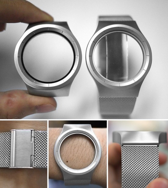
Ziiiro Watch

Ziiiro Watch: "

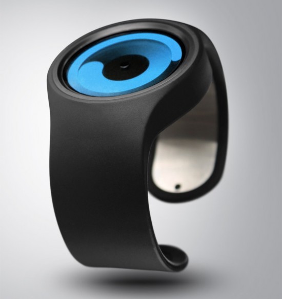
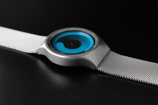
정말 시계에 대한 아이디어는 끝이 없는거 같다.
작년부터 시계쪽으로 괜찮은 디자인은 텍스트큐브때부터 스크랩 해두고 있는데,
매번 새롭고 참신한 디자인이 끊이질 않는다.
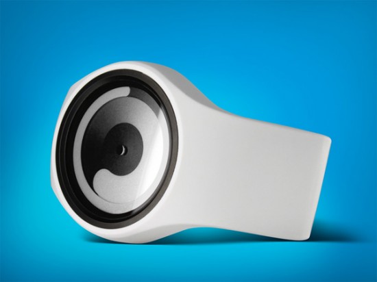
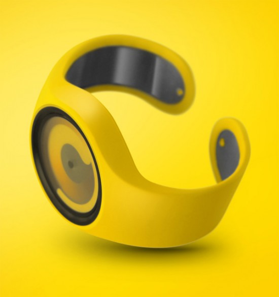
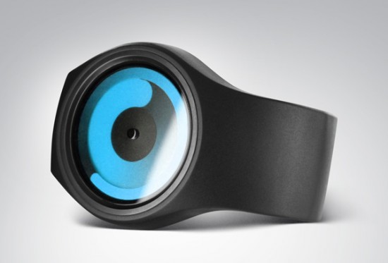
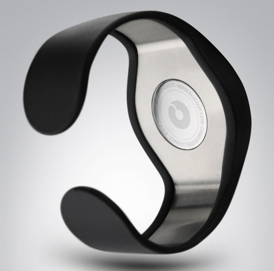
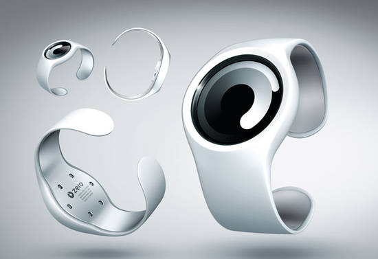
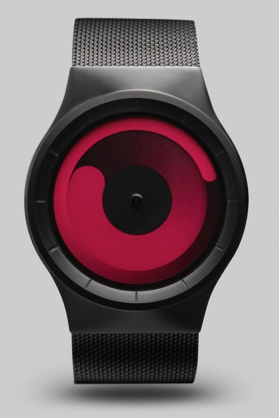
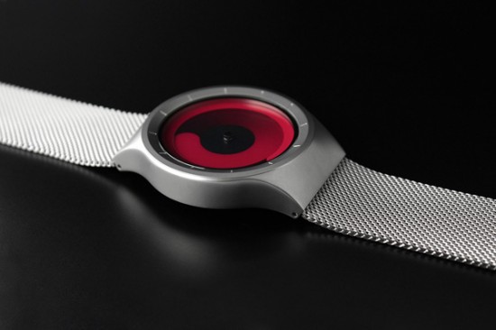
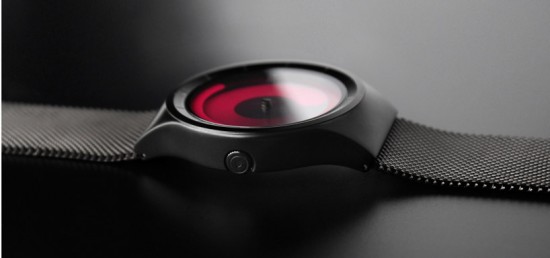
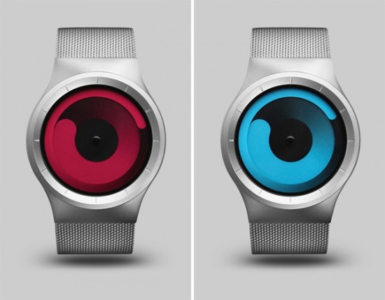
아래 디자인도 시간표시에 관하여 새로운 접근을 시도했다는 점에서 좋게 평가하고 싶다.
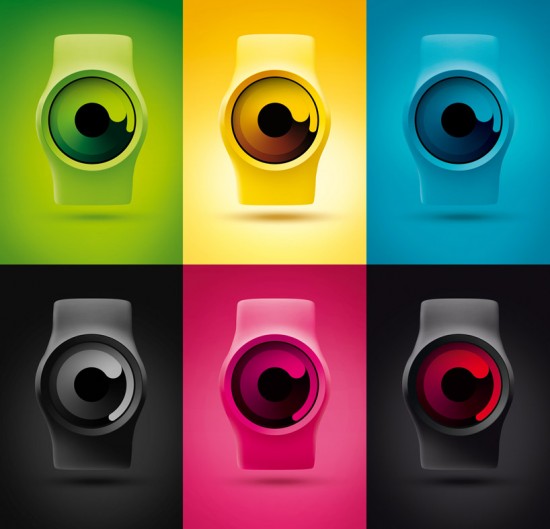
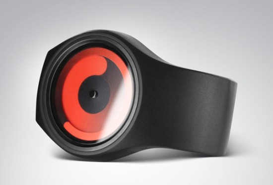
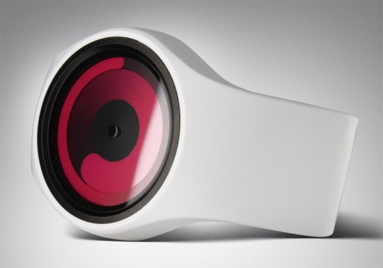
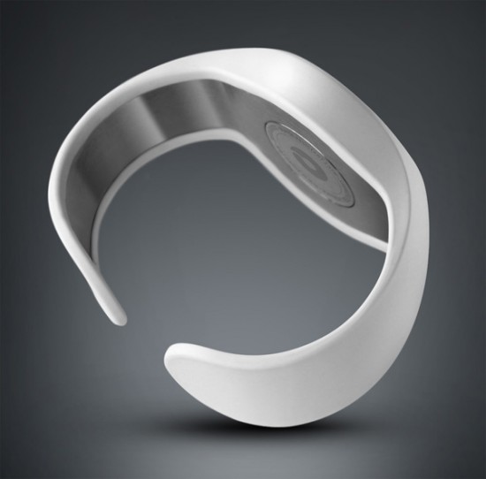
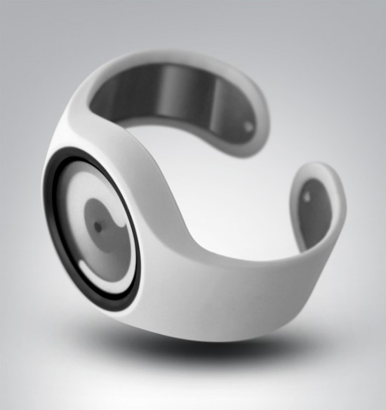
Un concept et design original pour cette montre du fabricant Ziiiro : la production du modèle Mercury affichant l’heure sous une forme spirale sur 2 niveaux (l’affichage de l’heure puis celui des minutes). Le cadran et le bracelet sont disponible dans une variation de 10 couleurs.


z1


z16


z3


z4


z13


z6


z7


z14


z15


z17


z18


z11


z12


z19


z2


z20


Previously on Fubiz


Copyright Fubiz™ - Suivez nous sur Twitter et Facebook


"