2010년 2월 26일 금요일

Google Office versus Facebook Office

Which giant would you prefer to work for: Google or Facebook?

It might be a question of personal preference. You can’t help but love one company’s work more than another, which leads to desire to work for them. Aside from that, you could use some objective measurements in choosing between the two.

Google office designGoogle office design
This might help you. We give you a chance to have a sneak view at the offices from both Google and Facebook. You’ll find that both are design great, to enhance the productivity of their workers. Absolutely no trace of standard office cubicles.

Google Office

Google office design

About Google: (as if you needed this)

Google Inc. is an American public corporation specializing in Internet search. It also generates profits from advertising bought on its similarly free-to-user e-mail, online mapping, office productivity, social networking and video-sharing services. Advert-free versions are available via paid subscription. Google has more recently developed an open source web browser and a mobile phone operating system. Its headquarters, often referred to as the Googleplex, is located in Mountain View, California. As of March 31, 2009  the company had 19,786 full-time employees. It runs thousands of servers across the world, processing millions of search requests each day and about one petabyte of user-generated data each hour.

Google office design

Google office design

Google office design

Google office design

Google office design

Google office design

Google office design

Google office design

Google office design

Google office design

Google office design

Google office design

Google office design

Google office design

Google office design

Facebook Office

About Facebook:

Facebook, Inc. is a company that operates and privately owns social networking website, Facebook. Users can add friends and send them messages, and update their personal profiles to notify friends about themselves. Additionally, users can join networks organized by city, workplace, school, and region. The website’s name stems from the colloquial name of books given at the start of the academic year by university administrations with the intention of helping students to get to know each other better.

Mark Zuckerberg
 founded Facebook with his college roommates and fellow computer science students Eduardo Saverin, Dustin Moskovitz and Chris Hughes while he was a student at Harvard University.  The website’s membership was initially limited to Harvard students, but was expanded to other colleges in the Boston area, the Ivy League, and Stanford University. It later expanded further to include any university student, then high school students, and, finally, to anyone aged 13 and over. The website currently has more than 350 million active users worldwide.

facebook office design

facebook office design

facebook office design

facebook office design

facebook office design

facebook office design

facebook office design

facebook office design

facebook office design

facebook office design

facebook office design

facebook office design

facebook office design

facebook office design

facebook office design

facebook office design

facebook office design

facebook office design

So what is your choice? I already made up my mind but I won’t tell you mine :)

Flexible Furniture

이런식의 가구 참 맘에 든다. ㅎㅎ


Ambient Lights Get Powered By Nothing

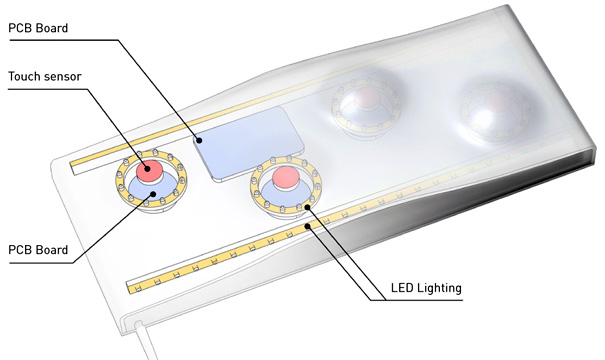
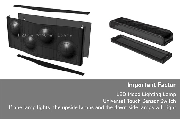
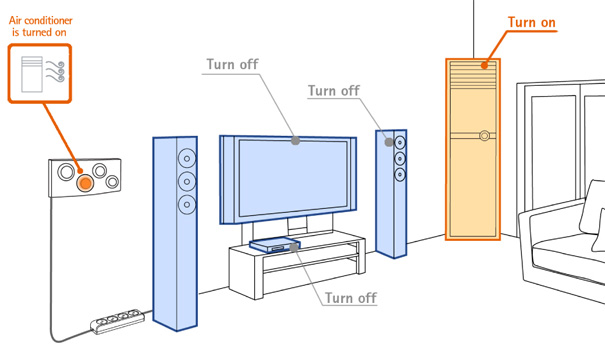
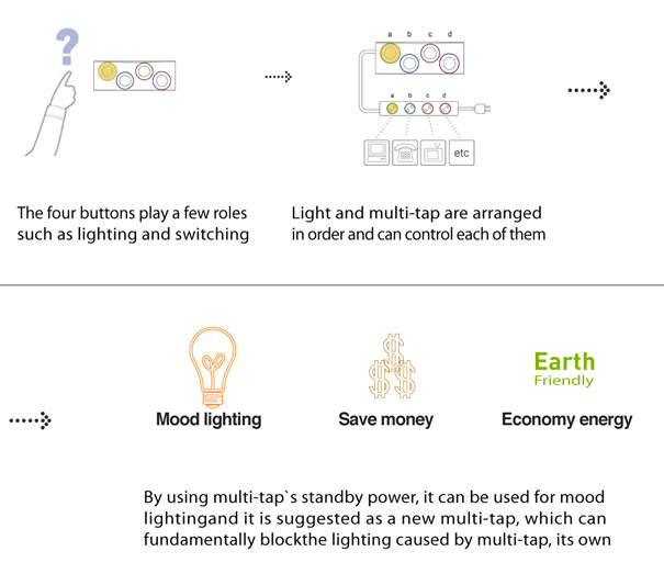
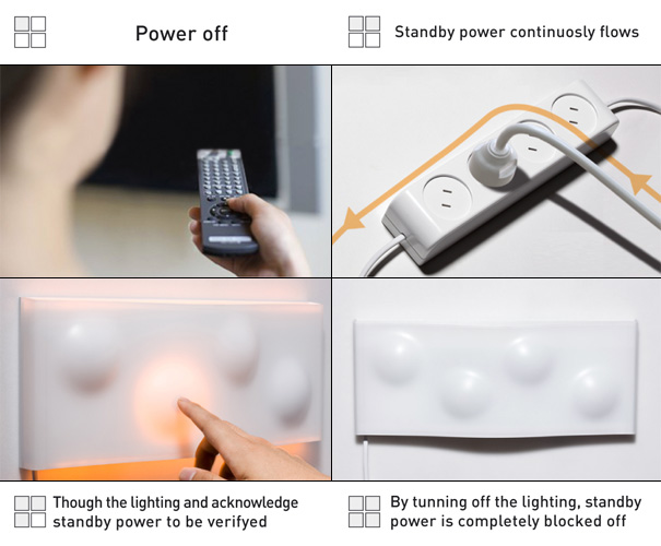
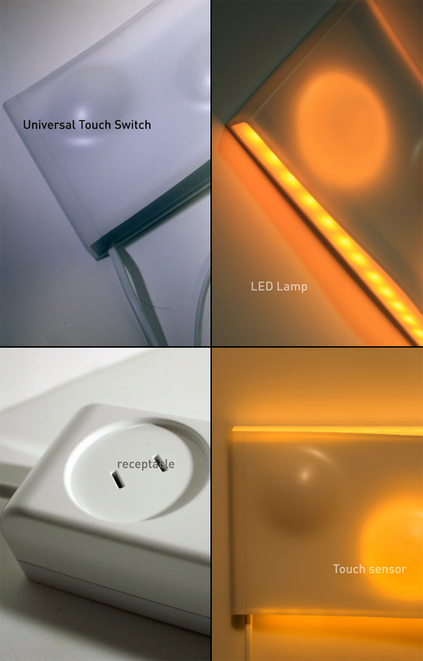
Well almost nothing. Here’s how the deal works: you have a multiple socket strip and probably using up all the sockets to power your gadgets. Its switched on and you keep forgetting to unplug or switch off the unused gadget from the strip and waste energy. With the Saving Energy Multitap, the so called wasted energy is no longer wasted….it gets sucked up to power this set of cool looking touch-sensitive ambient lights on the wall. The job of these ambient lights is to subtly remind you that you need to power off buddy!

The video of the working prototype convinces me that this is a neat idea!

Designers: Dong Hoon Han, Hwa Yong Shin & Dong Jin Shin

Energy Saving Multitap For Ambient Lights by Dong Hoon Han, Hwa Yong Shin & Dong Jin Shin

Multitap2

Multitap3

Multitap4

Multitap5

Multitap7

multitap8

multitap9

Multitap6

Entertain Yourself: Sony BRAVIA NX800 3D HDTV

간만에 소니에서 작품하나 나왔네. 우리나라에 들어오면 한번 가서 봐야겠다.

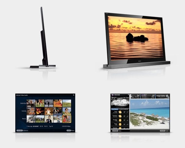
n this first of a three-part series called “Entertain Yourself”, I’m going to put together a quick and dirty home entertainment center out of three products I’ve reviewed earlier this year. Mind you, this won’t please the hardcore video or audiophile. I wanted products that seamlessly balance industrial design with home entertainment and as designers, we all know that’s how the general consumer perceives products. I call it utilitarian sex and first up is the stunning BRAVIA NX800 HDTV from Sony.

Designer: Sony (Buy it here)

sonybravia3dtv_01

My first introduction to the BRAVIA NX800 was thru a little video Sony produced about the auspicious design and the designers themselves. A brief glimpse into Sony’s Japanese headquarters and short interviews with the surprisingly young group of designers served its purpose by changing my mind about a company whom I once thought was extremely long in the tooth. These young people spoke of revision and change, admittingly taking responsibility for Sony’s lackluster design in the past decade. They saw 2010 as an opportunity to change everything. This time, they would define their own agenda. Instead of playing catch-up to other first rate brands, Sony would forge ahead with what they once dominated the ID landscape with; slick Japanese electronic design.

sonybravia3dtv_03

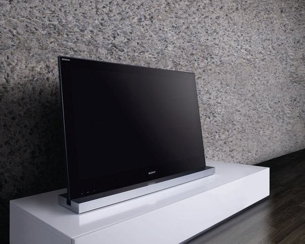
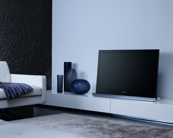
The NX800 is the first of many products to embrace this new design aesthetic Sony calls Monolithic. Think tall, sleek, angular, and statuesque. There’s nothing organic about it. It’s meant to stand in opposition to everything else around it. Love it or hate it, it draws you in. This is the first time in a long time where I’ve felt Sony has a win. This isn’t like anything else on the market. It doesn’t look like LG, Samsung, Vizio, Toshiba or Apple. This is uniquely Sony.

This is a good thing. Sony has always had great technology but they could never find a way to package it in a compelling way. Designed to create a remarkable sense of space, the 52″ NX800 has an innovative six-degree tilt, so you can position the TV at lower levels. Mounting on walls is so passe now. The entire screen is Edge LED backlight providing instant on/off. The latest BRAVIA Engine lives up to its reputation by delivering incredibly saturated imagery rich in detail and color. The 240Hz screen means action oriented imagery never “ghosts” or blurs as the refresh rate attempts to compensate. It’s all crystal clear, like glass.

sonybravia3dtv_04

Having a razor sharp screen isn’t enough these days. All the major manufactures now share their panel tech and just slap on buzz words to make it all sound alluring. To be successful you’ve got to embrace where digital entertainment is moving towards – the internet.

It’s got built in Wi-Fi and with your in-home broadband connection, you can access online content from Netflix, Slacker Radio, and YouTube. Although widgets are old news for computers – they’re new for TV’s. The NX800 lets you watch programs with multiple widgets open and arrange them however you want.

Spec wise it’s loaded. To name a few, full 1080p, 5.1 channel audio out, 16:9 aspect ratio, XMB interface, and of course the Sony logo illuminates. The one really interesting feature is “3D enabled”. Trade shows were abuzz this year with talks of 3D televisions. We’re getting close to the stage where imagery is beginning to move away from flat two dimensional representation. Of course it’s all an illusion and with the NX800, you’ll need Sony 3D glasses to get the effect. It may seem like a gimmicky feature but it shows Sony is serious about the future and this time, they will not be left behind. You can read the full specs here.

sonybravia3dtv_02

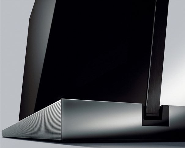
I’ve looked at upcoming panels from LG, Samsung, Toshiba, Sharp, and JVC. None of them resonate with me like the NX800 does. The TV stand by itself has more engineering in it than meets the eye. Most TV stands are a plasticky afterthought. This one holds up the display like a gigantic picture frame yet it’s delicate enough to adjust with a gentle touch, and touch is the name of the game here. There are no tactile buttons. All controls are embedded into the screen bezel which seamlessly blends into the frame. As you graze the glass-like surface, the controls illuminate as if they’re breathing life. It shows extreme attention to detail. Kudos Sony.

So now I’ve got my awesome TV. What’s next? Speakers! Watch out for part two of the “Entertain Yourself” series. Cheers!